3 Geoms
Everything is liable to change, even the title
A geom (short for geometric object) is a component that defines how data is visually represented in a plot. Geoms determine the type of visualization or the graphical shape that will be drawn.
“These geoms are the fundamental building blocks of ggplot2 (Wickham et al. 2026). They are useful in their own right, but are also used to construct more complex geoms. Most of these geoms are associated with a named [chart]: when that geom is used by itself in a [chart], that [chart] has a special name.” (Wickham 2016)
ggplot2 already has a long list of geoms. We won’t be discussing those unless there is an extension package that is an improvement to the original. Primarily, this chapter focuses on the geoms that ggplot2 does not include.
3.1 Area charts
Area charts are based on line charts. The area between the x-axis and each line (or the area between lines) is shaded to help highlight the volume of the data.
In this section, we’ll take a look at the horizon chart, an improved version of the ribbon chart, and the streamgraph. They are all different takes on the area chart.
3.1.1 Horizon chart
A horizon chart is a method for condensing time series data into a format that is both informative and relatively easy to interpret.
Often, when you have both positive and negative values, they lie on both sides of the x-axis. In a horizon chart, the negative values are on the same side as the positive ones.
We use color to show whether the values are positive or negative. But also for the magnitude of those values.
As Jonathan Schwabish points out in their book, Better Data Visualizations (Schwabish 2021), “the purpose of the horizon chart is not necessarily to enable readers to pick out specific values, but instead to easily spot general trends and identify extreme values”.
3.1.1.1 Viz #1: Helsinki temperatures, part I - ggHoriPlot
For the horizon chart, we’ll be using ggHoriPlot (Rivas-González 2022). The package includes various example data sets. But we’ll be using weather data from the Finnish Meteorological Institute (FMI). Its open data, weather observations are licensed under CC BY 4.0.
Using the FMI API (Application Programming Interface), I retrieved the average temperatures in Helsinki (Kaisaniemi weather station) for the years 2000-2024. You can take a look at the data below.
We have avg_temperature_celsius (daily average temperature (in Celsius)), day, month, and year. We also have the date_dummy column. It is there because we want to use the month as the x-axis. But the column needs to be in date format for our use case. So we need all the rows to have the same dummy year with real months and days. I chose 2024 because it was a leap year. Without it, all the rows with February 29th would have NA in that column instead of the correct values.
Before we can proceed with the visualization, we need to perform some data wrangling. First, we’ll remove outliers using the interquartile range (IQR) method.
library(dplyr)

# Filter temperature data to exclude outliers based on 1.5 * IQR method
cutpoints <- temperature_hki %>%
  filter(
    between(
      avg_temperature_celsius,
      quantile(
        avg_temperature_celsius, 0.25, na.rm = TRUE
      ) - 1.5 * IQR(avg_temperature_celsius, na.rm = TRUE),
      quantile(
        avg_temperature_celsius, 0.75, na.rm = TRUE
      ) + 1.5 * IQR(avg_temperature_celsius, na.rm = TRUE)
    )
  )
Fifteen outliers were filtered out, and we can continue. Next, we’ll calculate the midpoint of the temperature range and also divide the scale into evenly spaced value ranges. We’ll use the first as the origin for the horizon chart and the second to determine how to color the areas.
origin <- cutpoints %>%
  summarize(origin = mean(range(avg_temperature_celsius))) %>%
  pull(origin)

# 7 evenly spaced values across the temperature range, minus the midpoint
# (ggHoriPlot's scale input expects an even number of cutpoints)
scale <- cutpoints %>%
  summarize(
    min_val = min(avg_temperature_celsius),
    max_val = max(avg_temperature_celsius)
  ) %>%
  with(seq(min_val, max_val, length.out = 7)) %>%
  # round-trip to tibble so we can use dplyr::slice()
  tibble() %>%
  slice(-4) %>%
  pull(.)
The origin is 3.55, and the scale cutpoints are as follows: -19.3, -11.68, -4.07, 11.17, 18.78, 26.4.
Now we’re ready for the visualization itself. Besides ggHoriPlot and ggplot2, we’ll be using ggthemes (Arnold 2025) to provide us the theme. We’ll dive deeper into themes (including ggthemes in Section 9.1.6) later on in Chapter 9.
We’re using geom_horizon() to create the horizon chart. The arguments to pay attention to are fill (inside aes()), origin, and horizonscale. They are all using the origin and scale we calculated earlier. scale_fill_hcl() is also available in the ggHoriPlot package. Otherwise, we’re using basic ggplot2 functionalities.
Show the code
library(ggHoriPlot)
library(ggplot2)
library(ggthemes)

ggplot(temperature_hki) +

  geom_horizon(
    aes(
      date_dummy,
      avg_temperature_celsius,
      fill = ..Cutpoints..
    ),
    origin       = origin,
    horizonscale = scale
  ) +

  # Diverging palette, reversed so red = warm, blue = cold
  scale_fill_hcl(palette = "RdBu", reverse = TRUE) +

  facet_grid(vars(year)) +

  theme_few() +

  theme(
    axis.text.x     = element_text(size = 10),
    axis.text.y     = element_blank(),
    axis.title.y    = element_blank(),
    axis.ticks.y    = element_blank(),
    panel.border    = element_blank(),
    # No vertical space between yearly facets
    panel.spacing.y = unit(0, "lines"),
    plot.caption    = element_text(size = 8, hjust = 0, color = "#777777"),
    # Left margin bumped up so "Jan" isn't clipped
    plot.margin     = margin(10, 10, 10, 15),
    strip.text.y    = element_text(size = 8, angle = 0, hjust = 0)
  ) +

  scale_x_date(
    expand      = c(0, 0),
    date_breaks = "1 month",
    date_labels = "%b"
  ) +

  labs(
    title    = "Average daily temperature (°C) in Helsinki",
    subtitle = "From 2000 to 2024",
    caption  = "Data: Finnish Meteorological Institute open data, weather observations (CC BY 4.0) | Visualization: Antti Rask",
    x        = NULL
  )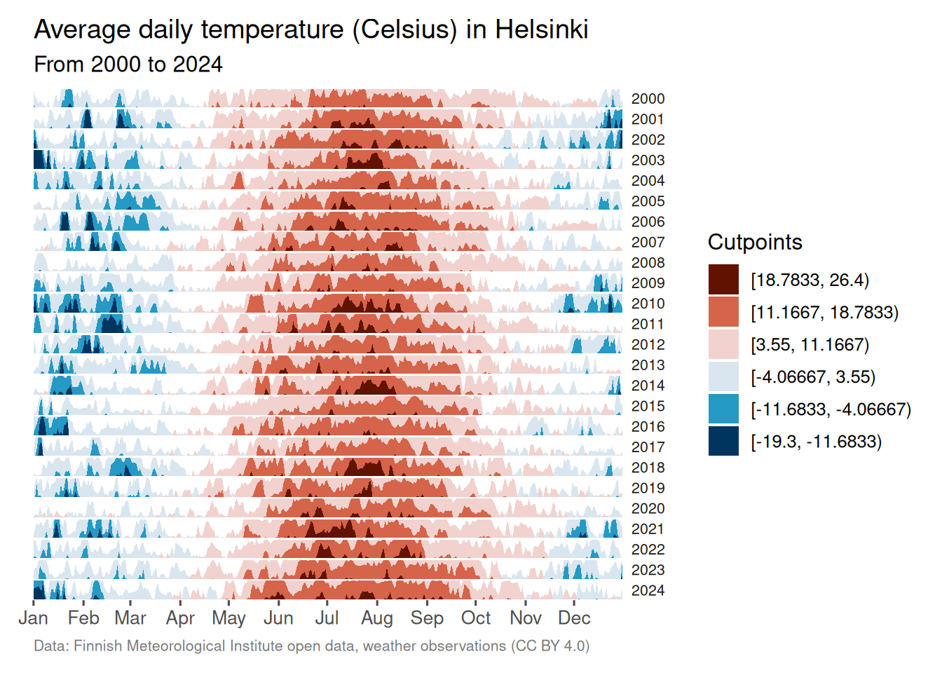
I’m not a climatologist, but it does seem like there is a trend, over time, of Helsinki having milder winters. The summer temperatures are less clear-cut and will need a closer look.
3.1.2 Ribbon chart (improved)
As the ggplot2 documentation tells us, an area chart is, in fact, a special case of a ribbon chart. That makes sense when you realize that every type of area chart has a ymin and ymax. In the basic area chart, ymin is zero, and ymax is y. (Wickham et al. 2026)
The ribbon chart, then, displays the area between two lines. geom_ribbon() gets the job done when the lines don’t meet. But as you’ll soon see, for those cases where they do, you need something called braiding. You can read more about it in the ggbraid (Grantham 2025) documentation.
3.1.2.1 Viz #2: IMDb movies, Part I - ggbraid
We’ll take a look at what the problem (and solution) looks like with real data. The question we’d like to answer here is which genre, comedy or drama, has produced more movies during the 20th century.
But let’s first examine the data we’ll be using for this. Time series data works best for this type of chart. Let’s stick to the ggplot2movies (Wickham 2015) data set that we first encountered in Section 2.1.2 and the movies_na tibble.
We’ll perform some transformations to prepare the data for visualization. In this case, we’ll need the data in two formats, long and short.
Let’s first create the long tibble consisting of genre, year, and n (for the count).
One minor detail to note here is that we’ll turn the genre column from character to factor format. We’ll use forcats (Wickham 2025a) from tidyverse (Wickham 2023) to do that. It’s not necessary in this case, but it’s good practice.
Next, we’ll split the genre into two separate columns, Comedy and Drama. They will retrieve their values from the n column.
We’ll also be adding a fill_condition column. We’ll use that later to determine which color to use to fill the area between the two lines.
movies_na_wide <- movies_na_long %>%
  pivot_wider(
    names_from  = genre,
    values_from = n
  ) %>%
  # fill_condition = TRUE when Drama outpaced Comedy that year
  mutate(fill_condition = Comedy < Drama)
Now we can return to the topic of why we need to use an extension for cases where the lines don’t stay separate.
Here’s what the basic visualization would look like with geom_ribbon() from ggplot2.
That won’t work if we want to use the ribbon chart to show where the two categories change places, indicating which is greater.
But that’s where ggbraid’s geom_braid() comes to the rescue. The basic code is the same. We’ll only switch the geom function.
The rest of the code is to make the visualization more presentable. Note that we’ll move the legend inside the plot. We’ll use the legend.position argument inside the theme() function to do that. There’s enough white space inside the plot to accommodate the legend. This way, we gain more space to showcase the time series element of the plot.
Show the code
library(ggbraid)
library(ggplot2)

ggplot() +

  geom_line(
    aes(year, n, linetype = genre),
    data = movies_na_long
  ) +

  geom_braid(
    aes(year, ymin = Comedy, ymax = Drama, fill = fill_condition),
    data  = movies_na_wide,
    alpha = 0.7
  ) +

  annotate(
    "text",
    x     = 1938,
    y     = 300,
    size  = 4,
    label = "More comedies than drama",
    hjust = 0.5,
    color = "#F36523"
  ) +

  annotate(
    "text",
    x     = 1975,
    y     = 80,
    size  = 4,
    label = "More drama than comedies",
    hjust = 0.5,
    color = "#125184"
  ) +

  scale_fill_manual(values = c("#F36523", "#125184")) +

  scale_x_continuous(
    expand = c(0, 1),
    limits = c(1899, 2001),
    breaks = seq(1900, 2000, by = 10)
  ) +

  scale_y_continuous(
    expand = c(0, 1),
    limits = c(0, 800),
    breaks = seq(0, 800, by = 100)
  ) +

  # Hide the fill legend; keep only the linetype legend for genre
  guides(fill = "none") +

  labs(
    linetype = NULL,
    title    = "100 years of cinema",
    subtitle = "Number of comedies vs. dramas throughout the 20th century",
    caption  = "Data: IMDb movies (1893-2005) via {ggplot2movies} | Visualization: Antti Rask",
    x        = NULL,
    y        = NULL
  ) +

  theme_bw() +

  theme(
    legend.direction = "horizontal",
    legend.box.background = element_rect(
      color     = "black",
      linetype  = "solid",
      linewidth = 0.5
    ),
    legend.key.size  = unit(2, "line"),
    legend.position  = c(0.19, 0.88), # relative position inside plot
    legend.text      = element_text(size = 10)
  )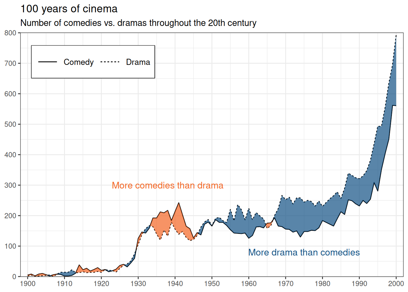
I’m not an expert on this topic either. Based on this data set, however, there appears to be a correlation between major wars (WWI, WWII, and the Vietnam War) and the production of more comedies than dramas.
3.1.2.2 Viz #3: Helsinki temperatures, part II - ggbraid
Let’s take a look at another ribbon chart. We can use the data set from Section 3.1.1, which contains average daily temperatures in Helsinki from 2000 to 2024. We’ll compare the two years, 2000 and 2024. Which one had more warmer days?
First, we’ll perform similar transformations as before and convert the data into both long and wide formats.
One minor detail to note here is that we’ll need to turn the year column from numeric to factor format. It won’t work as a category for the linetype argument otherwise. We’ll again use the forcats package to do that.
In this next transformation, note the use of the names_prefix argument. A column with a number as the first character of the name is not ideal. This will take care of that.
temperature_hki_wide <- temperature_hki_long %>%
  pivot_wider(
    names_from   = year,
    names_prefix = "year_",
    values_from  = avg_temperature_celsius
  ) %>%
  # fill_condition = TRUE when 2024 was warmer than 2000 that day
  mutate(fill_condition = year_2000 < year_2024)
We’ll also count the number (and percentage of total) of days where the average temperature is greater in 2000 and 2024. We’ll use this information for annotations.
# A tibble: 2 × 3
  fill_condition     n n_pct
  <lgl>          <int> <dbl>
1 FALSE            145 0.396
2 TRUE             221 0.604
Looks like 2024 has more days (60.4%) that were, on average, warmer than 2000 (39.6%).
The visualization itself is like the movie example. The most significant difference is the use of two packages from the tidyverse family.
str_glue() from stringr (Wickham 2025b) features a convenient implicit line break functionality. We’ll also use it to add the degree Celsius symbol (°C) to the y-axis.
as_date() from lubridate (Spinu et al. 2026) allows us to use the date in character format to map it to the x-axis. This helps us place the annotations in the correct position.
Show the code
library(ggbraid)
library(ggplot2)
library(lubridate)
library(stringr)

ggplot() +

  geom_line(
    aes(date_dummy, avg_temperature_celsius, linetype = year),
    data = temperature_hki_long
  ) +

  geom_braid(
    aes(
      date_dummy,
      ymin = year_2000,
      ymax = year_2024,
      fill = fill_condition
    ),
    data  = temperature_hki_wide,
    alpha = 0.7
  ) +

  annotate(
    "text",
    x     = as_date("2024-03-01"),
    y     = -17.5,
    size  = 4,
    label = str_glue(
      "2000 was warmer
      40 % of the days"
    ),
    hjust = 0.5,
    color = "#125184"
  ) +

  annotate(
    "text",
    x     = as_date("2024-11-15"),
    y     = 17.5,
    size  = 4,
    label = str_glue(
      "2024 was warmer
      60 % of the days"
    ),
    hjust = 0.5,
    color = "#F36523"
  ) +

  # Blue for 2000 warmer, orange for 2024 warmer
  scale_fill_manual(values = c("#125184", "#F36523")) +

  scale_x_date(
    date_breaks = "1 month",
    date_labels = "%b",
    expand      = c(0, 0.1)
  ) +

  # Append °C symbol to y-axis labels
  scale_y_continuous(labels = ~ str_glue("{.x} °C")) +

  # Hide the fill legend; keep only the linetype legend for year
  guides(fill = "none") +

  labs(
    linetype = NULL,
    title    = "Is the temperature rising?",
    subtitle = "Average daily temperatures (Celsius) in Helsinki, 2000 vs. 2024",
    caption  = "Data: Finnish Meteorological Institute open data, weather observations (CC BY 4.0) | Visualization: Antti Rask",
    x        = NULL,
    y        = NULL
  ) +

  theme_bw() +

  theme(
    legend.direction = "horizontal",
    legend.box.background = element_rect(
      color     = "black",
      linetype  = "solid",
      linewidth = 0.5
    ),
    legend.key.size  = unit(2, "line"),
    legend.position  = c(0.83, 0.12), # relative position inside plot
    legend.text      = element_text(size = 10),
    plot.caption     = element_text(size = 8, hjust = 1, color = "#777777")
  )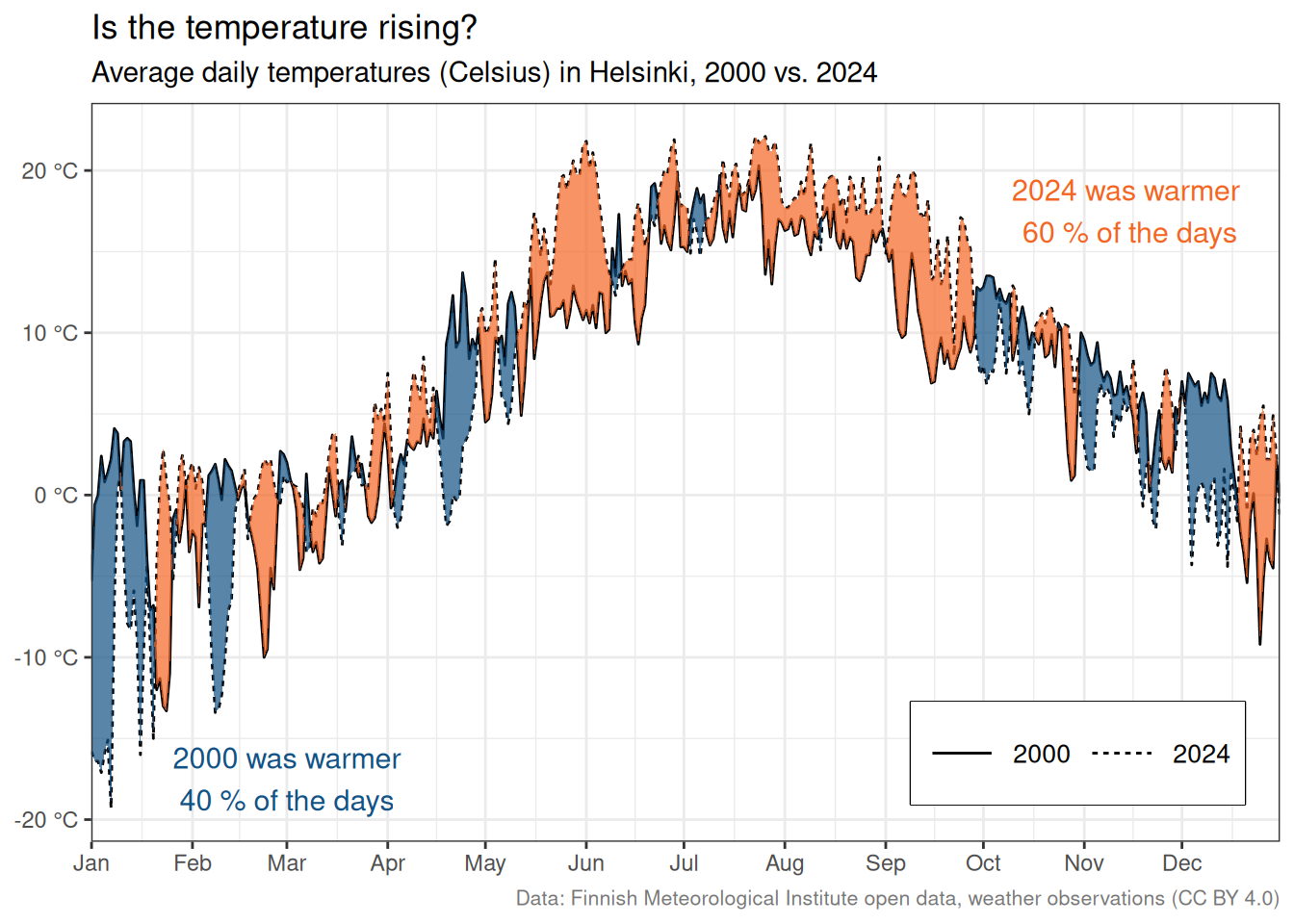
And so we have another perspective on the Helsinki temperature data set.
3.1.3 Streamgraph
A streamgraph is a stacked area chart where the areas are positioned around the central axis.
3.1.3.1 Viz #4: ggplot2 dependencies (ggstream)
If you’ve read the book in chronological order, you’ve already encountered a streamgraph in Section 1. We will use that visualization as the example in this section.
The purpose of this visualization is to illustrate how the ggplot2 dependencies have evolved from a small speck in 2007 to their current state at the end of 2025. This is the exact use case for which I would use a streamgraph.
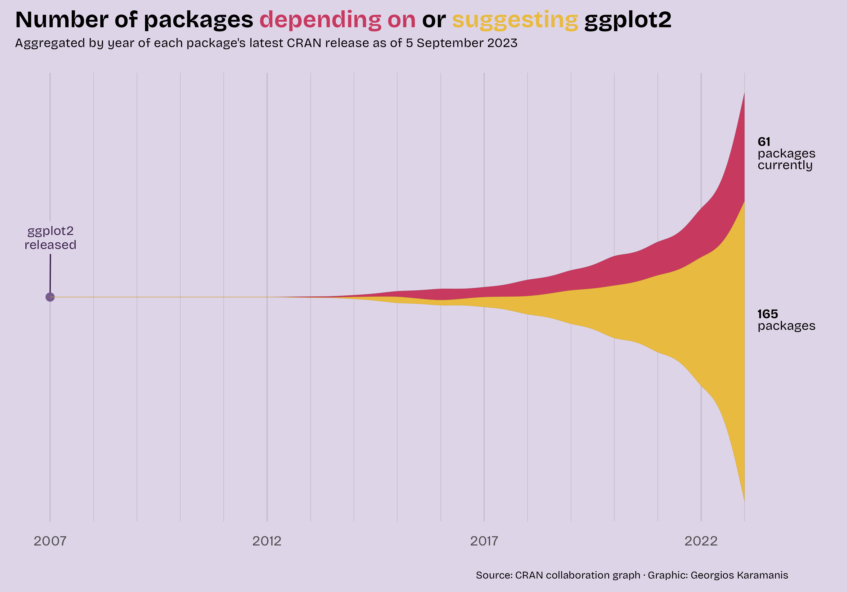
Before we proceed, I want to mention Georgios Karamanis. Their original visualization for Tidy Tuesday (see Figure 3.1) was the inspiration for my version.
If you want to know the differences, they are as follows:
- Use the initial release years instead of the latest release…
- …which meant switching the data source
- Use the ggplot2-related packages’ metadata
- Bring in a third type, Imports
- Change the color palette
- Change the fonts to Roboto Mono
- Annotate all the major ggplot2 releases
- Make the stream chart less wavy
- Other, smaller changes
We’ll cover these in more detail as we proceed.
Let’s take a look at the data we’re working with. It was gathered with pkgsearch (Csárdi and Salmon 2025).
We won’t reiterate the definitions of the different types (see Section 1 for them). But we can see that the count for each type starts small in 2007 and increases significantly by 2025.
Let’s first take a look at what the streamgraph would look like with default settings. We’ll use geom_stream() from ggstream (Sjoberg 2021) for that.
library(ggstream)

ggplot2_dependencies_by_year %>%
  ggplot() +
  geom_stream(
    aes(
      x    = year,
      y    = n,
      fill = type
    )
  )
That’s not bad for ten lines of code. But we can make it more presentable.
Let’s start with colors. In the previous visualizations, we’ve inserted the hex codes straight into the code. But since we need to use these colors in many places, let’s convert them into a vector so we don’t have to repeat ourselves.
color_1 <- "#F36523"
color_2 <- "#125184"
color_3 <- "#2E8B57"
colors_viz_4  <- c(color_1, color_2, color_3)

colors_viz_4
[1] "#F36523" "#125184" "#2E8B57"For the font, I wanted to use something different. Roboto is a slightly futuristic font (family) that I like. But it doesn’t come with R.
That’s why we’ll use showtext (Qiu 2026) (read more about it in Section 9.6.2).
library(showtext)

font_add_google("Roboto Mono", "roboto")
showtext_auto()
font_family <- "roboto"
Next, we’ll create the annotations that’ll be displayed on the right side of the graph.
The labels are in an HTML-style format. To be used later with ggtext (Wilke and Wiernik 2022). We’ll delve into this topic in more detail in Section 9.4.1.
annotation_numbers <- ggplot2_dependencies_by_year %>%
  summarize(
    n   = sum(n),
    .by = type
  ) %>%
  # sort alphabetically so the manual y-positions below line up
  arrange(type) %>%
  mutate(
    # manual y-positions matched to each stream layer's vertical center
    y = c(440, 75, -350),
    # HTML spans for ggtext::geom_richtext() to render with per-type colors
    label = case_when(
      type == "Depends" ~
        str_glue("**<span style='color:{color_1}'>{n}</span>**"),
      type == "Imports" ~
        str_glue("**<span style='color:{color_2}'>{n}</span>**"),
      type == "Suggests" ~
        str_glue("**<span style='color:{color_3}'>{n}</span>**")
    )
  )
Now it’s time to bring it all together.
Usually, you would start with the main geom for the plot. But we must begin with the data points and labels due to the layer order. We’re stacking layers on top of each other, and here we want the lines for the labels to stay behind the streamgraph.
The new packages we haven’t mentioned before are colorspace (Ihaka et al. 2024) and ggrepel (Slowikowski 2026).
We get back to them both in detail later, but colorspace (see more in Section 16.2.2.1) is used for color manipulation. In this graph, we’re making the borders of the areas slightly darker than the areas themselves. ggrepel (see more in Section 5.9) is used for creating labels that don’t overlap.
Show the code
library(colorspace)
library(ggplot2)
library(ggrepel)
library(ggstream)
library(ggtext)
library(stringr)

ggplot(ggplot2_dependencies_by_year) +

  # Anchor point for the first version label
  geom_point(
    aes(x = 2007, y = 0),
    data = tibble(),
    size = 1.5
  ) +

  # Version markers along the streamgraph (manually positioned)
  geom_label_repel(
    aes(x = 2007, y = 0, label = "{ggplot2}\nver 0.5"),
    data        = tibble(),
    nudge_y     = 75,
    linewidth   = 0,
    lineheight  = 0.9,
    family      = font_family
  ) +

  geom_label_repel(
    aes(x = 2014, y = 50, label = "{ggplot2}\nver 1.0"),
    data       = tibble(),
    nudge_y    = 115,
    linewidth  = 0,
    lineheight = 0.9,
    family     = font_family
  ) +

  geom_label_repel(
    aes(x = 2015, y = 125, label = "{ggplot2}\nver 2.0"),
    data       = tibble(),
    nudge_y    = 100,
    linewidth  = 0,
    lineheight = 0.9,
    family     = font_family
  ) +

  geom_label_repel(
    aes(x = 2018, y = 100, label = "{ggplot2}\nver 3.0"),
    data       = tibble(),
    nudge_y    = 200,
    linewidth  = 0,
    lineheight = 0.9,
    family     = font_family
  ) +

  geom_label_repel(
    aes(x = 2025, y = 450, label = "{ggplot2}\nver 4.0"),
    data       = tibble(),
    nudge_y    = 100,
    linewidth  = 0,
    lineheight = 0.9,
    family     = font_family
  ) +

  geom_stream(
    aes(
      x     = year,
      y     = n,
      fill  = type,
      color = after_scale(darken(fill)) # borders slightly darker than fills
    ),
    # bw controls waviness (bandwidth for kernel density); closer to 1 = less wavy
    bw        = 1,
    linewidth = 0.1
  ) +

  geom_richtext(
    aes(
      x     = 2025 + 0.2,
      y     = y,
      label = label
    ),
    data       = annotation_numbers,
    hjust      = 0,
    lineheight = 0.9,
    label.size = NA,
    size       = 5,
    family     = font_family
  ) +

  scale_x_continuous(
    breaks       = seq(2007, 2025, 2),
    minor_breaks = 2007:2025
  ) +

  scale_fill_manual(values = colors_viz_4) +

  # Allow annotations to extend outside the plot area
  coord_cartesian(clip = "off") +

  labs(
    title = str_glue("Number of packages on CRAN in 2025 <span style='color:{color_1}'>depending on</span>, <span style='color:{color_2}'>importing</span>, or <span style='color:{color_3}'>suggesting</span> {{ggplot2}}"),
    subtitle = "Aggregated by the initial package release years. Categories may change from one version to another and were taken from the original versions.",
    caption  = "Data: CRAN via {pkgsearch} | Visualization: Antti Rask | Updated: 2025-12-31"
  ) +

  theme_minimal(base_family = font_family) +

  theme(
    axis.text.x = element_text(
      size   = 14,
      face   = "bold",
      margin = margin(10, 0, 0, 0)
    ),
    axis.text.y           = element_blank(),
    axis.title            = element_blank(),
    legend.position       = "none",
    panel.grid.major.y    = element_blank(),
    panel.grid.minor.y    = element_blank(),
    plot.margin           = margin(10, 10, 10, 10),
    plot.title            = element_markdown(
      face  = "bold",
      size  = 20,
      hjust = 0.5
    ),
    plot.subtitle = element_text(
      hjust  = 0.5,
      margin = margin(0, 0, 20, 0)
    ),
    plot.caption = element_text(
      size   = 10,
      color  = darken("darkgrey", 0.4),
      hjust  = 0.5,
      margin = margin(20, 0, 0, 0)
    )
  )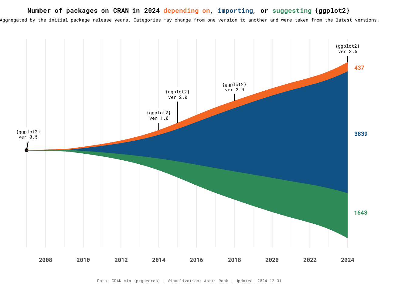
Streamgraph, like other area graphs, isn’t the best for making detailed comparisons between groups. But it’s excellent for creating a broader picture of what’s going on in the data.
There is also an interactive version of streamgraph, built in to the package. We’ll check it out in Section 12.3.
3.2 Bar charts
Bar charts are the backbone of data visualization. And ggplot2 handles most types of bar charts out of the box. However, there are situations where you may want to take it a step further.
In this section, we’ll take a look at the Likert chart and the mosaic chart, also known as the Marimekko chart or the Mekko chart, after the company (go Finland!).
3.2.1 Likert chart
A Likert chart is a diverging stacked bar chart. It’s used to visualize responses to a questionnaire using the Likert (or similar) scale format. The “respondents are asked to indicate their degree of agreement or disagreement on a symmetric agree-disagree scale for each of a series of statements” (Burns and Bush 2007).
For Likert charts, ggstats (Larmarange 2026) is my package of choice. It also has other functionalities, which we’ll return to in Section 4.14.1.
3.2.1.1 Viz #5: PISA 2022 Questionnaire (gglikert)
I was thinking of a good, open data source for the Likert chart. Most packages (ggstats included) use older PISA (Programme for International Student Assessment) questionnaires for the example data. I was able to find more recent data and selected seven statements from the PISA 2022 Student Questionnaire (OECD 2023). There was a lot of data to choose from, but I selected the statements that a) dealt with creativity and b) had the fewest number of NAs in the answers.
I chose three countries to compare. Canada, Finland and Great Britain. I would’ve been interested in seeing a comparison between the US as well, but sadly the data was all NAs for these statements.
Let’s first take a look at the data we have.
There is a country column, but the other columns each have answers to one of the statements. They all have a technical ID as a name (e.g., ST339Q04JA) and these possible values:
- Strongly disagree
- Disagree
- Agree
- Strongly agree
- NA
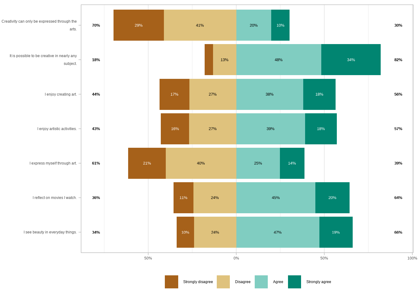
We can already take a look at what this data would look like visualized with one function, gglikert(). We don’t want to include the country column yet.
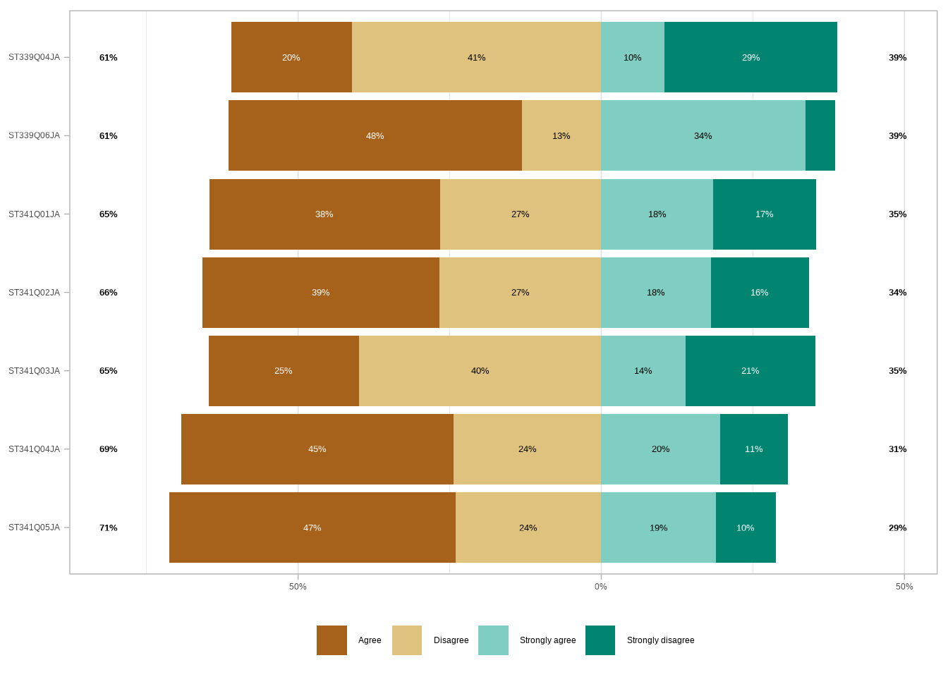
By default, gglikert() ignores the NA values. If we wanted to, we could turn them into a character string. And then use the exclude_fill_values argument to “[count] them in the denominator for computing proportions” (Larmarange 2026).
Now, two things are wrong with this first plot.
- We don’t know what the statements were (unless we go and look elsewhere)
- The categories aren’t in the correct order. The default order for the character type is alphabetical
First, let’s look at the labels we have in a separate tibble.
Let’s turn them into a named vector that we can use. We’ll use the deframe() function from tibble (Müller and Wickham 2026) for that.
                                            ST339Q04JA
  "Creativity can only be expressed through the arts."
                                            ST339Q06JA
"It is possible to be creative in nearly any subject."
                                            ST341Q01JA
                               "I enjoy creating art."
                                            ST341Q02JA
                        "I enjoy artistic activities."
                                            ST341Q03JA
                       "I express myself through art."
                                            ST341Q04JA
                        "I reflect on movies I watch."
                                            ST341Q05JA
                    "I see beauty in everyday things."
Then we’ll create another vector for the agreement levels. Notice that they are now in the order we want them to be in.
agreement_levels <- c(
  "Strongly disagree",
  "Disagree",
  "Agree",
  "Strongly agree"
)
We’ll convert the statement columns in our data set into factors. And we’ll use the fct_relevel() function to reorder those factors in the desired order.
Let’s see what the plot looks like now after those two changes.
Much better! Let’s try adding the country as a grouping variable. We have two basic options for arguments, facet_cols and facet_rows. Let’s first see what it would look like if we facet the plot with the countries as columns.
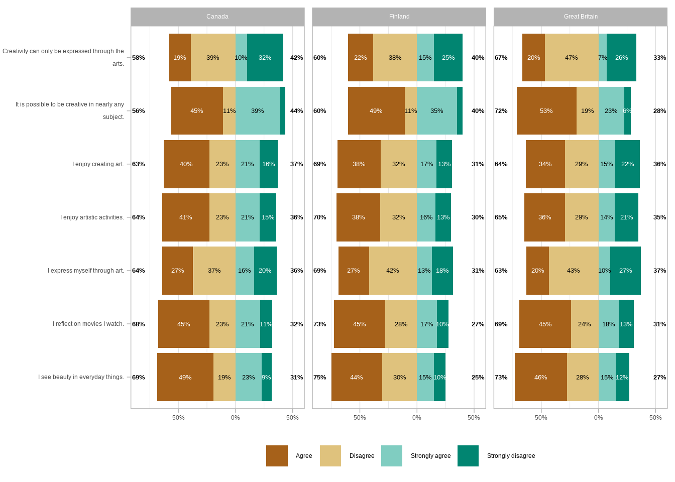
That makes it quite hard to compare the values between the countries. Let’s see what it would look like if we facet the plot with the countries as rows.
That’s way too busy, and still, it’s hard to compare the countries. Luckily, we have a third option.
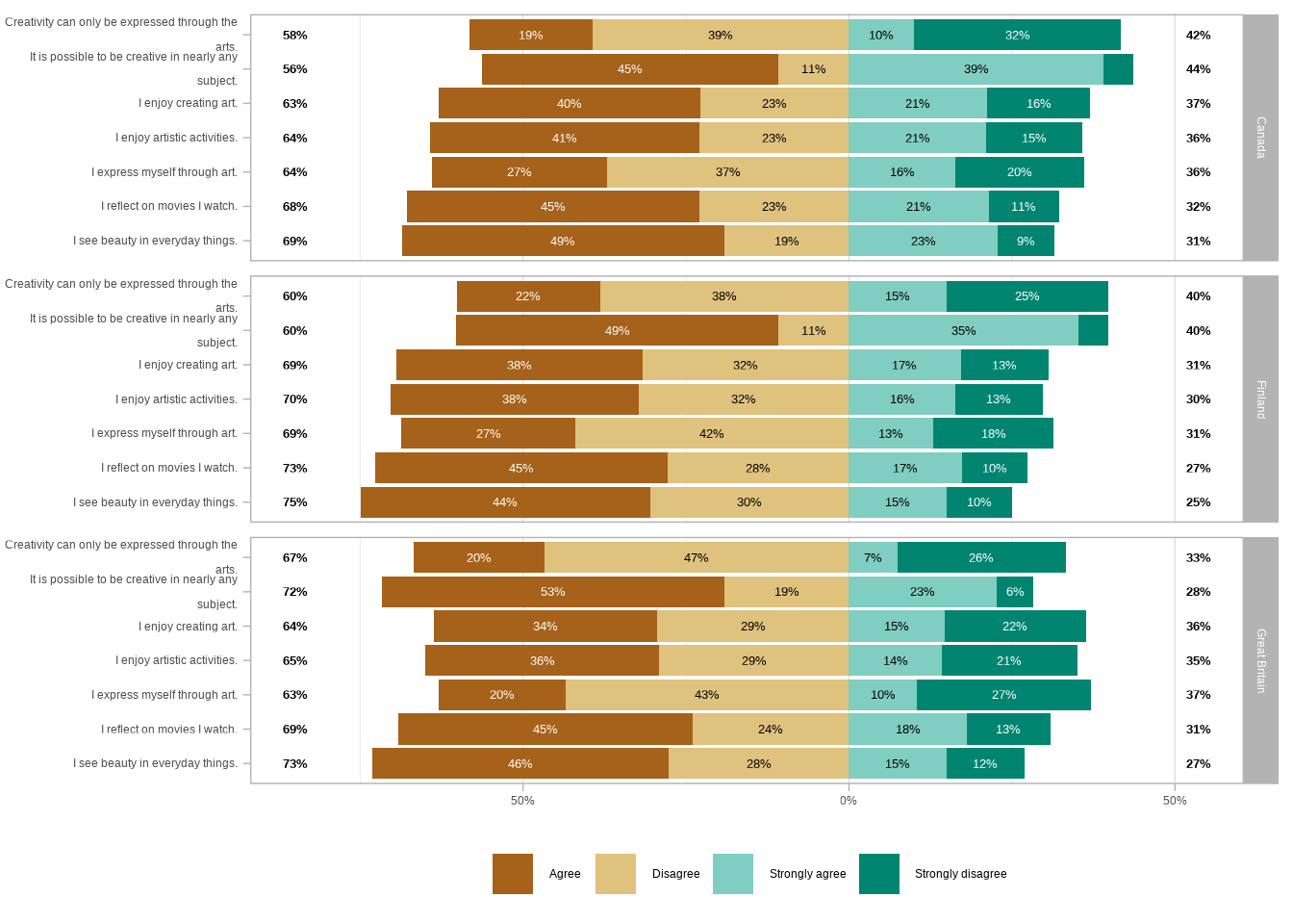
We can facet the rows using the statements as the upper level. And then use the countries as a lower level. This way, the plot is both readable and easier to compare between the countries.
The rest of the code is primarily used to make the visualization more presentable.
Show the code
library(ggplot2)
library(ggstats)

gglikert(
  pisa_2022_statements_refactored,
  include         = -country,
  y               = "country",
  variable_labels = pisa_2022_labels_vector,
  sort            = "descending",
  facet_rows      = vars(.question)
) +

  # Override the default facet layout: move statement labels to the left and wrap them
  facet_grid(
    rows     = vars(.question),
    switch   = "y",
    labeller = label_wrap_gen(30) # wrap long labels at ~30 chars
  ) +

  # Diverging red-to-blue palette mirrors the disagree-to-agree axis
  scale_fill_manual(
    values = c(
      "Strongly disagree" = "#ca0020",
      "Disagree"          = "#f4a582",
      "Agree"             = "#92c5de",
      "Strongly agree"    = "#0571b0"
    )
  ) +

  labs(
    title    = "The majority of respondents in Canada, Finland, and Great Britain feel creative, even if they don't all express themselves through art",
    subtitle = "PISA 2022 Student Questionnaire - a sample of 7 statements",
    caption  = "Data: OECD | Visualization: Antti Rask"
  ) +

  theme(
    text                  = element_text(family = "wqy-microhei"),
    axis.text             = element_text(color = "#333333"),
    strip.background.y    = element_rect(fill = "#FFD166"),
    # "top" here means outside the panels — in this left-facet layout, that's the left edge
    strip.placement.y     = "top",
    strip.text.y.left     = element_text(angle = 0, hjust = 0.5, color = "#333333"),
    legend.margin         = margin(0, 0, 0, 0),
    plot.caption          = element_text(hjust = 0, color = "#333333"),
    plot.caption.position = "plot",
    plot.margin           = margin(10, 10, 10, 10),
    plot.title.position   = "plot"
  )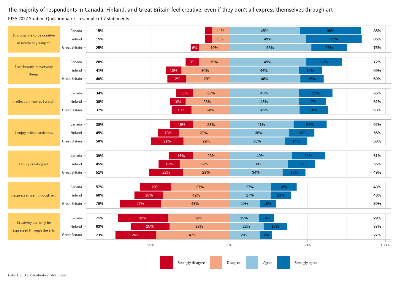
The kids seem to be alright! At least when it comes to feeling creative. There are some interesting differences between the three countries, but nothing too extreme.
3.2.2 Mosaic chart
A mosaic chart is a special type of stacked bar chart. It differs from a normal one in that “the heights and widths of individual shaded areas vary” (Wilke 2019).
To create a mosaic chart, we’ll be using marimekko (Kałędkowski 2026). It provides geom_marimekko() as a native ggplot2 layer, so you can combine it with any other ggplot2 functionality (facets, themes, annotations, etc.).
Note! I wrote the first version of this chapter with ggmosaic (Jeppson et al. 2021) in mind. But it was archived from CRAN on 2025-11-10 (as issues remained uncorrected despite reminders). Even the version on GitHub isn’t working currently. So I had to find a replacement. Marimekko is that package.
3.2.2.1 Viz #6: IMDb movies, Part II - marimekko
We return to the IMDb movies data set. This time, looking at how many movies in each genre have a certain MPAA rating (among those movies that have a rating in the first place).
We’ll use the already familiar movies_na data set. But we’ll have to make some adjustments to get it ready for marimekko.
The new function here is fct_infreq(). It helps us order the factor levels by size, even though we don’t have a separate column for those counts.
movies_marimekko <- movies_na %>%
  pivot_longer(Action:Short, names_to = "genre") %>%
  filter(
    value != 0,
    !is.na(mpaa)
  ) %>%
  select(mpaa, genre) %>%
  mutate(
    # MPAA levels ordered by restrictiveness, not alphabetically
    mpaa = mpaa %>% factor(levels = c("PG", "PG-13", "R", "NC-17")),
    # fct_infreq() orders genre levels by frequency, largest first
    genre = genre %>% as_factor() %>% fct_infreq(.)
  )
That’s all we need to take a look at the basic functionality of geom_marimekko().
Marimekko differs from the old ggmosaic approach in that it uses a formula to specify the variables instead of wrapping them in product(). The formula ~ mpaa | genre tells Marimekko to use MPAA for the columns and genre for the segments within each column.
Then we assign genre to the fill aesthetic. The gap parameter controls the space between the tiles. And show.legend does exactly what the name promises.
We can use this basic version as a basis for the final version. So let’s also assign the plot to plot_marimekko.
You get the idea. Next, let’s see what we need to do to get this into a more presentable state.
- Add text labels to show the counts of the different tiles (except the small ones)
- Change the color palette with ggthemes
- Use a custom theme,
theme_marimekko()that comes with marimekko
First, let’s take a look at those text labels. Marimekko comes with a geom_marimekko_text() function. It reads tile positions from the preceding geom_marimekko() layer. You only need to provide the label aesthetic. This is much simpler than the old approach. Before, you had to extract tile coordinates manually from the built plot object.
We can reference computed variables via after_stat(). The computed variable weight gives us the aggregated count for each tile. Some of the tiles are so small that it doesn’t make sense to add labels to them. We’ll use after_stat() to hide labels conditionally when the count is under 70.
We have as many as seven categories (genres). We’ll use scale_fill_colorblind() from ggthemes to create a nice colorblind-friendly color palette.
Show the code
library(ggthemes)

plot_marimekko +

  geom_marimekko_text(
    aes(
      label = after_stat(
        if_else(weight < 70, NA, weight) # hide labels on small tiles
      )
    ),
    colour   = "white",
    fontface = "bold",
    size     = 5,
    na.rm    = TRUE
  ) +

  scale_fill_colorblind() +

  labs(
    title    = '"Yes More Drama in My Life"',
    subtitle = "A count of different combinations of genre and MPAA ratings",
    caption  = "Data: IMDb movies (1893-2005) via {ggplot2movies} | Visualization: Antti Rask",
    x        = "",
    y        = ""
  ) +

  theme_marimekko() +

  theme(
    axis.text = element_text(
      size   = 14,
      face   = "bold"
    ),
    plot.title = element_text(
      face  = "bold",
      size  = 16,
      hjust = 0.5,
      margin = margin(20, 0, 5, 0)
    ),
    plot.subtitle = element_text(
      size  = 14,
      hjust  = 0.5,
      margin = margin(0, 0, 10, 0)
    ),
    plot.caption = element_text(
      size   = 10,
      color  = "darkgrey",
      hjust  = 0.5,
      margin = margin(0, 0, 10, 0)
    ),
    plot.margin = margin(0, 10, 0, 0)
  )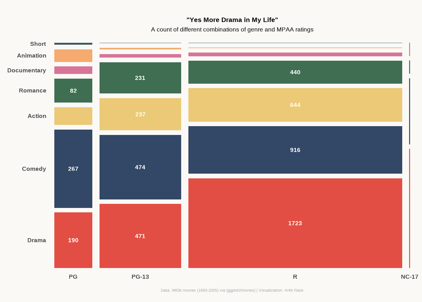
The label code is much simpler than what we’d have needed before. geom_marimekko_text() handles many things that I had to calculate manually when using ggmosaic.
Mosaic chart isn’t meant for comparing small details. But it does give you a good overview of the proportions between the different category combinations.
3.3 Density charts
Density charts work similarly to histograms. They make it easy to visualize a distribution (or distributions) of data. Again, ggplot2 has a geom called geom_density() that you can use for a basic density chart.
In this section, we’ll take a look at the raincloud chart and the ridgeline chart. The latter was formerly known as the joyplot, after Joy Division’s 1979 album Unknown Pleasures (Wilke 2017).
3.3.1 Raincloud chart
A raincloud chart isn’t a geom. It contains three different geoms, boxplot, violin (or at least half of one), and point. They were “presented in 2019 as an approach to overcome issues of hiding the true data distribution when plotting bars with errorbars — also known as dynamite plots or barbarplots — or box plots” (Scherer 2021).
You could create a raincloud chart using those individual geoms and mostly ggplot2. Cédric Scherer demonstrates this here, creating a raincloud chart using the Palmer Penguins data.
We have, however, a package, ggrain (Judd et al. 2026), that we can use for the same purpose. That there are numerous ways to accomplish the same task is both the beauty and the primary source of frustration with these tools. In any case, you get to choose which one works the best for you. You can also mix and match. You’ll see this when we reach the final visualization.
3.3.1.1 Viz #7: IMDb movies, Part III - ggrain
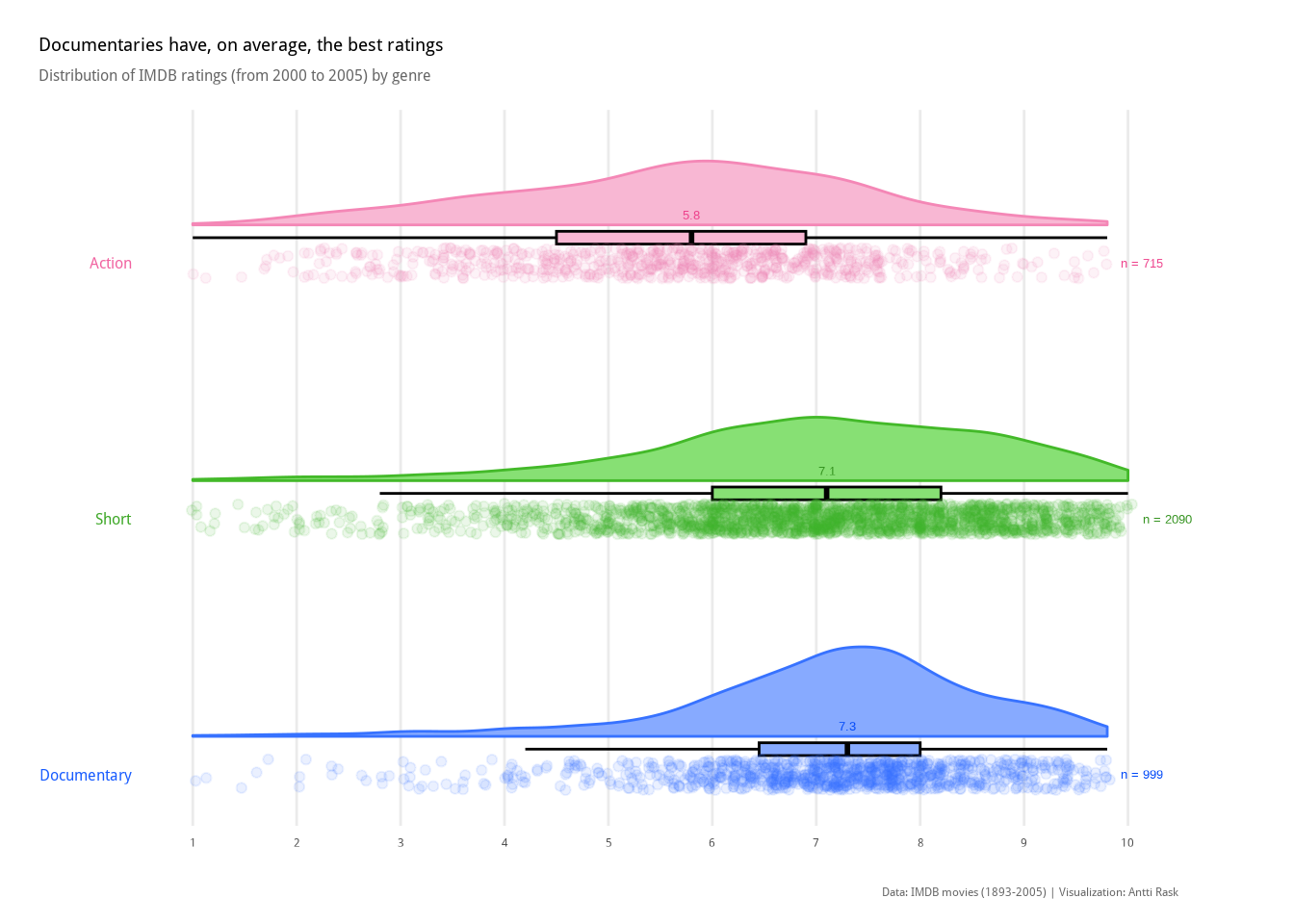
We return, once again, to the IMDb movies data set. This time, looking at how the ratings for movies in three genres (Action, Documentary, and Short) are distributed. We’ll make some adjustments for ggrain. As you can see, data wrangling plays a significant role in the data visualization process. Context is key.
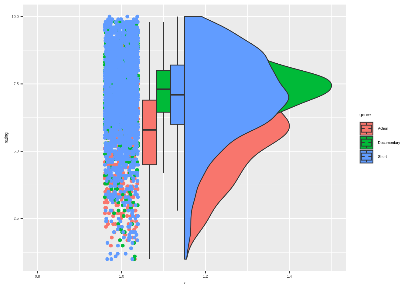
We’re left with a lot of genre-rating pairings. Here’s what they look like using only the default settings of geom_rain().

We have the points on the left, the boxplot in the middle, and the half-violin on the right. This already tells us something. However, upon examining the points, there are too many to make much sense without taking action. We’ll get back to that in the final visualization.
Before we proceed, I would like us to examine the version where the different groups overlap. That requires us to use an additional package, ggpp (Aphalo 2026). We borrow the function position_dodgenudge() from it. We’ll explore other uses of the package in Section 5.8.
The cov argument is used to assign a covariate to color the dots by. boxplot.args.pos lets us add a list of positional arguments for the boxplot. There are similar arguments for line (which we won’t use), point, and violin. Otherwise, it’s pretty much the same code as in the first example.
library(ggpp)

movies_ggrain %>%
  ggplot(
    aes(
      x    = 1,
      y    = rating,
      fill = genre
      )
  ) +
  geom_rain(
    # cov groups rainclouds by genre while sharing x = 1 in the aes
    cov              = "genre",
    boxplot.args.pos = list(
      position = position_dodgenudge(
        x     = 0.1,
        width = 0.1
      ),
      width = 0.1 # boxplot width (separate from the dodge width above)
    )
  )
As you can see, the alpha argument would be much needed also here. It’s impossible to see all the overlapping elements without it.
Besides that, I can see uses for both the separate and overlapping versions of the chart. Let’s use the first one for the cleaned-up version.
One new function from the forcats package, fct_reorder(). This is one of my most used forcats functions. It allows us to reorder the categories (genre) by the values in another column (rating). Super helpful with bar charts, and also the best tool to use here. It makes more sense to order categories like this, rather than in the default alphabetical order, if they can be compared.
We’ll use the stat_summary() functions to foreshadow Chapter 4. One for counting and annotating the median, the other for counting and annotating the sample size. These two are copied from Cédric’s code and are here to remind us that you can often combine code from two sources. There are also some other touches, such as the darken()/lighten() effects from colorspace. They were also from that same source.
Since we are showing all the points in the plot, there’s no need to show the outliers in the boxplot. That is done by assigning NA to the outlier.shape argument.
Show the code
library(colorspace)
library(forcats)
library(ggplot2)
library(ggrain)

colors_vis_7 <- c(
  "Action"      = "#f487b6",
  "Documentary" = "#3772FF",
  "Short"       = "#43B929"
)

# Axis label colors, ordered to match the factor levels after fct_reorder()
colors_vis_7_axis <- c("#3772FF", "#43B929", "#f487b6")

# Summary function for stat_summary: positions sample-size label above each group
add_sample <- function(x) {
  return(
    c(
      y     = max(x) + 0.025, # nudge above the highest point
      label = length(x)
    )
  )
}

ggplot(
  movies_ggrain,
  aes(
    fct_reorder(genre, rating, .desc = TRUE), # order genres by median rating
    rating,
    fill  = genre,
    color = genre
  )
) +

  geom_rain(
    rain.side    = "r", # density ("rain") on the right
    boxplot.args = list(
      color         = "black",
      outlier.shape = NA # hide outliers — all points are already shown
    ),
    point.args     = list(alpha = 0.1),
    point.args.pos = list(position = position_jitter(seed = 1, width = 0.06))
  ) +

  # Median value, printed above each raincloud
  stat_summary(
    aes(
      label = round(after_stat(y), 2),
      # stage() + after_scale() darkens the text relative to each group's color
      color = stage(genre, after_scale = darken(color, 0.2, space = "HLS"))
    ),
    geom  = "text",
    fun   = "median",
    size  = 3.5,
    vjust = -5
  ) +

  # Sample size, printed beside each raincloud
  stat_summary(
    aes(
      label = paste("n =", after_stat(label)),
      color = stage(genre, after_scale = darken(color, 0.2, space = "HLS"))
    ),
    geom     = "text",
    fun.data = add_sample,
    size     = 3.5,
    hjust    = -0.25
  ) +

  scale_color_manual(
    values = colors_vis_7,
    guide  = "none"
  ) +

  # Fills are lighter variants of the outlines for contrast
  scale_fill_manual(
    values = lighten(colors_vis_7, 0.4, space = "HLS"),
    guide = "none"
  ) +

  scale_y_continuous(breaks = seq(1, 10, by = 1)) +

  # Horizontal layout; clip = "off" lets the "n =" labels extend past the panel
  coord_flip(xlim = c(1.4, NA), clip = "off") +

  labs(
    x        = NULL,
    y        = NULL,
    title    = "Documentaries have, on average, the best ratings",
    subtitle = "Distribution of IMDb ratings (from 2000 to 2005) by genre",
    caption  = "Data: IMDb movies (1893-2005) | Visualization: Antti Rask"
  ) +

  theme_minimal() +

  theme(
    axis.text.y = element_text(
      color = darken(colors_vis_7_axis, 0.1, space = "HLS"),
      face  = "bold",
      size  = 12
    ),
    panel.grid.major.y = element_blank(),
    panel.grid.minor   = element_blank(),
    plot.title         = element_text(
      face = "bold",
      size = 14
    ),
    plot.title.position = "plot",
    plot.subtitle = element_text(
      color  = "grey40",
      margin = margin(0, 0, 10, 0),
      size   = 12
    ),
    plot.caption = element_text(
      color  = "grey40",
      margin = margin(15, 0, 0, 0)
    ),
    plot.margin = margin(15, 45, 10, 15),
    text        = element_text(family = "wqy-microhei"),
  )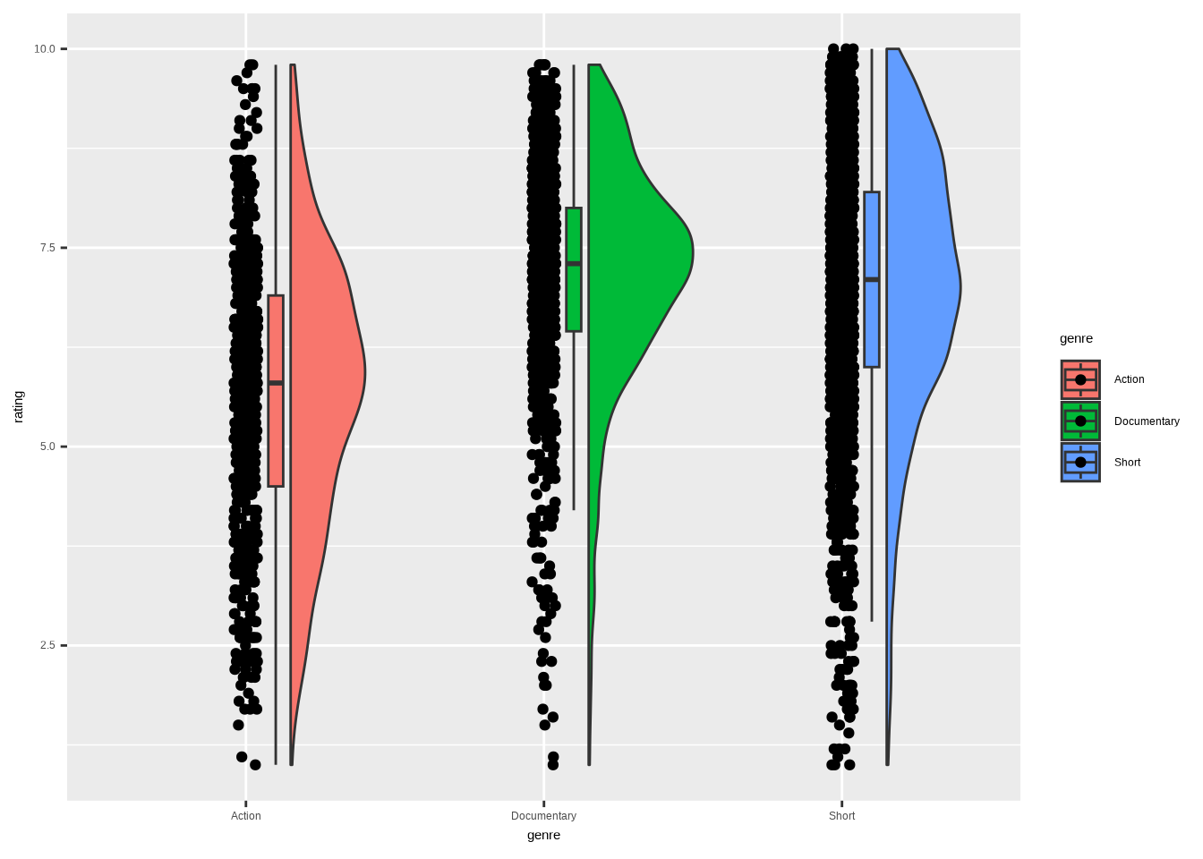
This way, we have the best of all three worlds. We can see that the Documentary genre has the highest median. It also has the strongest concentration of points (which also shows in the half-violin) around the median. Especially compared to Action.
3.3.2 Ridgeline chart
A ridgeline chart is a good alternative to the violin plot. They “tend to work particularly well if [you] want to show trends in distributions over time. […] The purpose of the [chart] is not to show specific density values but instead to allow for easy comparison of density shapes and relative heights across groups” (Wilke 2019).
We will use ggridges (Wilke 2025) to create our ridgeline chart. If you’re familiar with ggplot2 extensions, you might have known a package called ggjoy that did the same. It was deprecated, though, and you should update your old scripts to use ggridges instead.
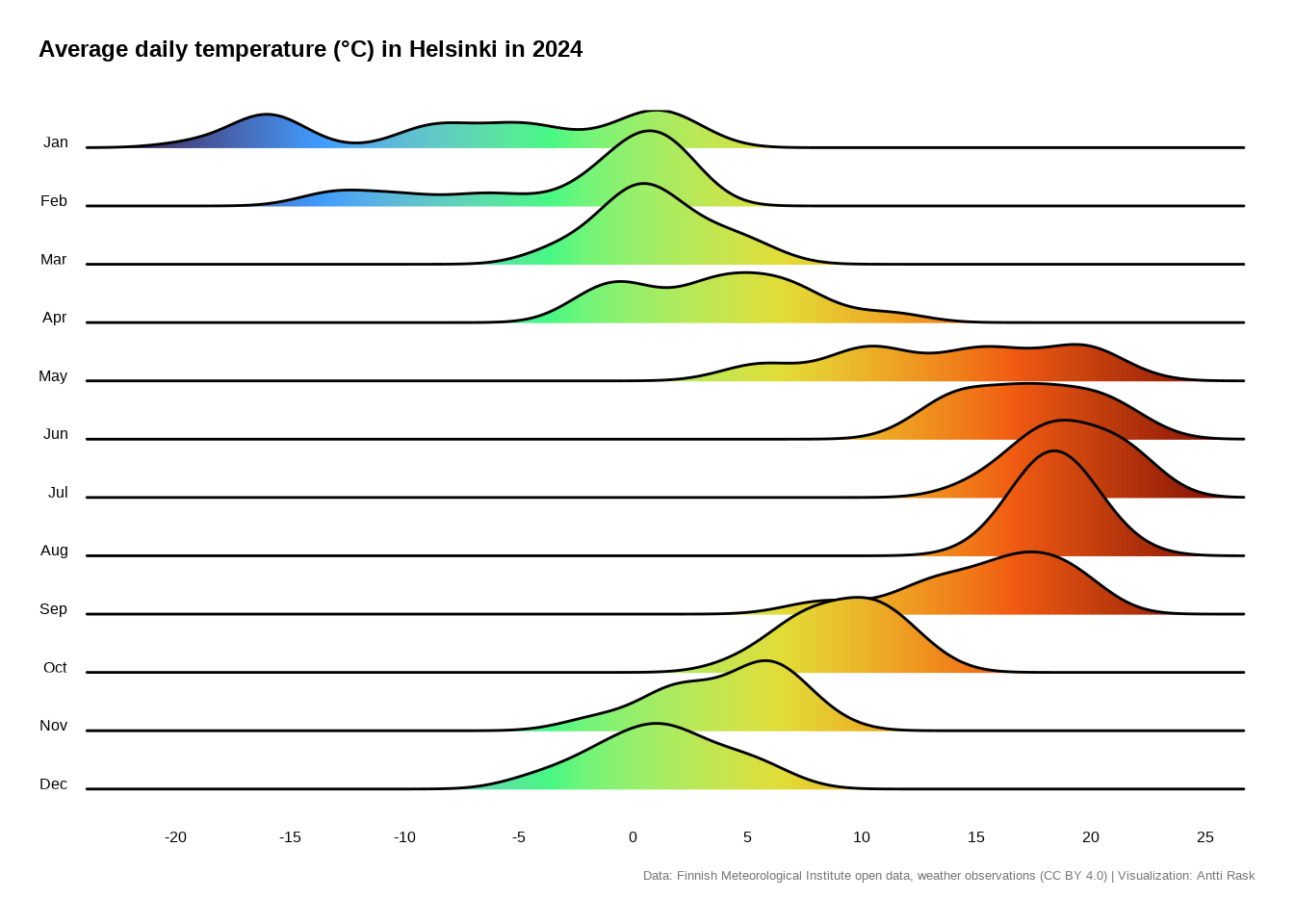
3.3.2.1 Viz #8: Helsinki temperatures, part III - ggridges
Since the ridgeline chart works well for distributions over time, let’s use the Helsinki temperatures data. I’m interested in seeing how the daily average temperatures are distributed by month in 2024.
Let’s start by getting the data ready. The one new trick is using month.abb. It’s a constant built into R. We have the month numbers in the data set and can use them in combination.
fct_rev() is the newest forcats function we get to use. It just reverses the order of factor levels. If we didn’t use it, the order of months in the plot would be from December to January. And it feels more natural to have them from January to December.
library(dplyr)
library(forcats)

temperature_ggridges <- temperature_hki %>%
  filter(year == 2024) %>%
  mutate(
    month_name = factor(
      month.abb[month], # month.abb is base R: c("Jan", "Feb", ..., "Dec")
      levels  = month.abb,
      ordered = TRUE
    ) %>%
      # Reverse so Jan ends up at the top of the ridgeline (y axis is bottom-up)
      fct_rev()
  ) %>%
  select(avg_temperature_celsius, month_name)
Let’s again start with the most simple version of the visualization. ggridges comes with various density geoms. The most basic one is geom_density_ridges().

Simple, yet effective. I even like the grayscale feel. But we can help the reader a little bit more by making some adjustments.
We’ll switch the geom to geom_density_ridges_gradient(), because we want to add some color. option = “H” from scale_fill_viridis_c() seems like an intuitive color scale for temperature data. ggridges comes with the theme_ridges() function that works well with the rest of the functions, as expected.
Show the code
library(ggplot2)
library(ggridges)

ggplot(
  temperature_ggridges,
  aes(
    avg_temperature_celsius,
    month_name,
    fill = after_stat(x) # map fill to the x value (temperature) for a gradient
  )
) +

  geom_density_ridges_gradient() +

  scale_x_continuous(
    breaks = seq(-20, 25, by = 5),
    expand = c(0.01, 0.01)
  ) +

  scale_fill_viridis_c(option = "H") +

  labs(
    x        = NULL,
    y        = NULL,
    title    = "Average daily temperature (°C) in Helsinki in 2024",
    caption  = "Data: Finnish Meteorological Institute open data, weather observations (CC BY 4.0) | Visualization: Antti Rask"
  ) +

  theme_ridges(grid = FALSE) +

  theme(
    axis.ticks      = element_blank(),
    legend.position = "null",
    plot.margin     = margin(15, 15, 15, 15),
    plot.title      = element_text(
      face   = "bold",
      size   = 18,
      margin = margin(0, 0, 20, 0)
    ),
    plot.caption = element_text(
      color  = "#777777",
      size   = 10,
      margin = margin(10, 0, 0, 0)
    ),
    plot.title.position = "plot"
  )
Of course, it would be nice to see how the distributions have changed over the years. One way to do that is by using animation. For that, see Section 13.2.
3.4 Geometric primitives
There comes a time when you need a geometric primitive for your visualization. It is possible to create them using only ggplot2. But, to be honest, it isn’t very easy.
In this section, I’ll introduce you to ggforce (Pedersen 2025a). It’s a package that, among other things, lets you draw a variety of geometric primitives. We can file them under two main categories: lines and shapes.
Let’s first create a Geometric Primitives Visual Catalog. It’s a single composite figure showing all ggforce primitives at a glance. We’ll use patchwork (Pedersen 2025b) to combine the multiple plots into one visualization (see Section 18.1 for more).
3.4.1 The Visual Catalog
Before we begin, we are aware that we’ll be incorporating the same theme elements into all the plots. Let’s create a function to do that so we don’t have to repeat the same code.
library(dplyr)
library(ggforce)
library(ggplot2)
library(patchwork)
library(tibble)

# Helper: shared minimal theme for catalog tiles
tile_theme <- function(subtitle) {
  list(
    coord_fixed(clip = "off"),
    labs(subtitle = subtitle),
    theme_void(),
    theme(
      legend.position = "none",
      plot.subtitle   = element_text(
        hjust  = 0.5,
        face   = "bold",
        size   = 11,
        margin = margin(0, 0, 5, 0)
      ),
      plot.background = element_rect(
        fill      = "#fafafa",
        color     = "#e0e0e0",
        linewidth = 0.4
      ),
      plot.margin = margin(8, 8, 8, 8)
    )
  )
}

# Shared colors
accent <- "#125184"
fill_1 <- "#92c5de"
fill_2 <- "#f4a582"
3.4.1.1 Lines
For our purposes, a line is a mark connecting two points. It doesn’t have to be straight (see Bézier curve). These geoms are “parameterised versions of different line types” (Pedersen 2025a), making it easier to draw them.
Show the code
# Arc
p_arc <- ggplot() +
  geom_arc(
    aes(x0 = 0, y0 = 0, r = 1, start = 0, end = 3 * pi / 2),
    color     = accent,
    linewidth = 1.2
  ) +
  geom_point(aes(x = 0, y = 0), size = 2, color = accent) +
  tile_theme("geom_arc")

# B-spline
bspline_pts <- tibble(
  x = c(-2, -1, 0, 1, 2),
  y = c(0, 2, -1, 2, 0)
)

p_bspline <- ggplot(bspline_pts) +
  geom_bspline(
    aes(x = x, y = y),
    color     = accent,
    linewidth = 1.2
  ) +
  geom_point(
    aes(x = x, y = y),
    color = fill_2,
    size  = 2.5
  ) +
  tile_theme("geom_bspline")

# Bezier
bezier_pts <- tibble(
  x = c(0, 0.5, 1.5, 2),
  y = c(0, 2, -1, 1)
)

p_bezier <- ggplot(bezier_pts) +
  geom_bezier(
    aes(x = x, y = y),
    color     = accent,
    linewidth = 1.2
  ) +
  geom_point(
    aes(x = x, y = y),
    color = fill_2,
    size  = 2.5
  ) +
  tile_theme("geom_bezier")

# Diagonal
p_diagonal <- ggplot() +
  geom_diagonal(
    aes(x = 0, y = 0, xend = 3, yend = 2),
    color     = accent,
    linewidth = 1.2
  ) +
  geom_diagonal(
    aes(x = 0, y = 0, xend = 3, yend = -1),
    color     = fill_2,
    linewidth = 1.2
  ) +
  geom_point(aes(x = 0, y = 0), size = 2.5, color = accent) +
  tile_theme("geom_diagonal")

# Link (improved paths)
p_link <- ggplot() +
  geom_link(
    aes(
      x         = 0,
      y         = 0,
      xend      = 3,
      yend      = 2,
      alpha     = after_stat(index),
      linewidth = after_stat(index)
    ),
    color = accent
  ) +
  tile_theme("geom_link")
3.4.1.2 Shapes
For our purposes, a shape is a two-dimensional, flat area with a defined boundary made of lines, curves, or points.
“These geoms allow you to draw different types of parameterised shapes, all taking advantage of the benefit of the geom_shape() improvements to ggplot2::geom_polygon().” (Pedersen 2025a)
Show the code
# Arc bar (wedge)
wedge_data <- tibble(
  start = c(0, pi / 2, pi, 3 * pi / 2),
  end   = c(pi / 2, pi, 3 * pi / 2, 2 * pi),
  fill  = c("a", "b", "c", "d")
)

p_arc_bar <- ggplot(wedge_data) +
  geom_arc_bar(
    aes(
      x0    = 0,
      y0    = 0,
      r0    = 0.4,
      r     = 1,
      start = start,
      end   = end,
      fill  = fill
    ),
    color = "white"
  ) +
  scale_fill_manual(values = c(fill_1, accent, fill_2, "#2E8B57")) +
  tile_theme("geom_arc_bar")

# Circle
circle_data <- tibble(
  x0 = c(-1, 0.5, 0),
  y0 = c(0, 0.5, -0.5),
  r  = c(0.8, 0.6, 0.5)
)

p_circle <- ggplot(circle_data) +
  geom_circle(
    aes(x0 = x0, y0 = y0, r = r, fill = factor(r)),
    alpha = 0.6,
    color = accent
  ) +
  scale_fill_manual(values = c(fill_1, fill_2, "#2E8B57")) +
  tile_theme("geom_circle")

# Ellipse
p_ellipse <- ggplot() +
  # Regular ellipse
  geom_ellipse(
    aes(x0 = 0, y0 = 0, a = 2, b = 1, angle = pi / 6),
    fill      = fill_1,
    alpha     = 0.5,
    color     = accent,
    linewidth = 1
  ) +
  # Superellipse
  geom_ellipse(
    aes(x0 = 0, y0 = 0, a = 2, b = 1, angle = pi / 6, m1 = 3),
    fill      = fill_2,
    alpha     = 0.4,
    color     = accent,
    linewidth = 1,
    linetype  = "dashed"
  ) +
  tile_theme("geom_ellipse")

# Shape (improved polygon)
shape_pts <- tibble(
  x = c(0, 1, 0.8, 0.2),
  y = c(0, 0, 1, 0.8)
)

p_shape <- ggplot(shape_pts, aes(x, y)) +
  geom_shape(
    expand = unit(0.2, "cm"),
    radius = unit(0.2, "cm"),
    fill   = fill_1,
    color  = accent
  ) +
  geom_polygon(fill = fill_2, alpha = 0.7) +
  tile_theme("geom_shape")

# Regular polygon (regon)
regon_data <- tibble(
  x0    = c(-1.5, 0, 1.5),
  y0    = 0,
  sides = c(3, 5, 6),
  r     = 0.7,
  angle = 0
)

p_regon <- ggplot(regon_data) +
  geom_regon(
    aes(
      x0    = x0, y0 = y0,
      sides = sides, r = r, angle = angle,
      fill  = factor(sides)
    ),
    color = accent
  ) +
  scale_fill_manual(values = c(fill_1, fill_2, "#2E8B57")) +
  tile_theme("geom_regon")

# Compose the catalog with patchwork

# Row labels as text plots
label_lines <- ggplot() +
  annotate(
    "text",
    x        = 0.5,
    y        = 0.5,
    label    = "Lines",
    fontface = "bold",
    size     = 5,
    color    = accent
  ) +
  theme_void() +
  theme(plot.margin = margin(0, 0, 0, 0))

label_shapes <- ggplot() +
  annotate(
    "text",
    x        = 0.5,
    y        = 0.5,
    label    = "Shapes",
    fontface = "bold",
    size     = 5,
    color    = accent
  ) +
  theme_void() +
  theme(plot.margin = margin(0, 0, 0, 0))

catalog <- (
  # Row 1: Lines
  label_lines + p_arc + p_bspline + p_bezier + p_diagonal + p_link +
    plot_layout(ncol = 6, widths = c(0.6, 1, 1, 1, 1, 1))
) / (
  # Row 2: Shapes
  label_shapes + p_arc_bar + p_circle + p_ellipse + p_shape + p_regon +
    plot_layout(ncol = 6, widths = c(0.6, 1, 1, 1, 1, 1))
) +
  plot_annotation(
    title    = "ggforce Geometric Primitives at a Glance",
    subtitle = "Lines Connect Points, Shapes Define Bounded Areas",
    theme    = theme(
      plot.title = element_text(
        face  = "bold",
        size  = 18,
        hjust = 0.5
      ),
      plot.subtitle = element_text(
        size   = 12,
        hjust  = 0.5,
        color  = "grey40",
        margin = margin(0, 0, 10, 0)
      )
    )
  )
And here’s the visual catalog showing us some of the possibilities:
Now that we’ve seen what the geometric primitives building blocks are, let’s build something interesting with some of them.
3.4.1.3 Viz #9: Helsinki temperatures, part IV - ggforce
We already looked at the Helsinki temperatures data set from different angles. But here’s one more. Let’s build a radial chart comparing the monthly average temperatures in Helsinki in 2000 and 2024.
Why use primitives for something like this? As the ggforce docs note, geom_arc_bar() “makes it possible to draw arcs and wedges as known from pie and donut charts” (Pedersen 2025a) without coord_polar(). This gives us full control over positioning, layering, and annotations that would be difficult or downright impossible with coord_polar().
We’ll use geom_arc_bar() for the temperature wedges, geom_circle() for the center disc and the ring separator, and geom_text() for month labels around the outside.
Show the code
library(dplyr)
library(ggforce)
library(ggplot2)
library(stringr)
library(tibble)

# Monthly averages for 2000 and 2024
temperature_radial <- temperature_hki %>%
  filter(year %in% c(2000, 2024)) %>%
  summarise(
    avg_temp = mean(avg_temperature_celsius, na.rm = TRUE),
    .by      = c(year, month)
  ) %>%
  # Each month occupies 1/12 of the circle (pi/6 radians). We start at the
  # top (12 o'clock = pi/2) and go clockwise, which is decreasing angle in
  # standard math convention. The offset nudges the wedges 2 months
  # counterclockwise so they align with the month labels.
  mutate(
    month_width = 2 * pi / 12,
    offset      = -2 * month_width,
    start       = pi / 2 - (month - 1) * month_width + offset,
    end         = pi / 2 - month * month_width + offset,
    year        = factor(year)
  )

# Inner ring = 2000, outer ring = 2024. The gap between r = 2.0 and r0 = 2.2
# is the visual separator between rings.
ring_2000 <- temperature_radial %>%
  filter(year == 2000) %>%
  mutate(
    r0 = 1.0,
    r  = 2.0
  )

ring_2024 <- temperature_radial %>%
  filter(year == 2024) %>%
  mutate(
    r0 = 2.2,
    r  = 3.2
  )

radial_data <- bind_rows(ring_2000, ring_2024)

# Month labels positioned just outside the outer ring
month_labels <- tibble(
  month     = 1:12,
  label     = month.abb,
  # Point to the CENTER of each wedge — hence (month - 0.5)
  angle_rad = pi / 2 - (month - 0.5) * (2 * pi / 12),
  x         = 3.7 * cos(angle_rad),
  y         = 3.7 * sin(angle_rad)
)

ggplot() +

  # Temperature wedges first, so the center disc can cover their inner edges
  geom_arc_bar(
    data = radial_data,
    aes(
      x0    = 0,
      y0    = 0,
      r0    = r0,
      r     = r,
      start = start,
      end   = end,
      fill  = avg_temp
    ),
    color     = "white",
    linewidth = 0.5
  ) +

  # White disc covers the inner hole created by r0 = 1.0 on the first ring
  geom_circle(
    aes(x0 = 0, y0 = 0, r = 0.9),
    fill  = "white",
    color = NA
  ) +

  # Center text, year labels, and month labels
  annotate(
    "text",
    x        = 0,
    y        = 0.15,
    label    = "Helsinki",
    size     = 5,
    fontface = "bold",
    color    = "#333333"
  ) +

  annotate(
    "text",
    x          = 0,
    y          = -0.3,
    label      = "Monthly Avg.\nTemperature (\u00B0C)",
    size       = 3,
    color      = "#777777",
    lineheight = 0.9
  ) +

  annotate(
    "text",
    x        = 0,
    y        = 0.75,
    label    = "2000",
    size     = 4.5,
    fontface = "bold",
    hjust    = 0.5,
    color    = "#555555"
  ) +

  annotate(
    "text",
    x        = 0,
    y        = 3.4,
    label    = "2024",
    size     = 4.5,
    fontface = "bold",
    hjust    = 0.5,
    color    = "#555555"
  ) +

  # Month labels stay horizontal — no rotation around the circle
  geom_text(
    data = month_labels,
    aes(x = x, y = y, label = label),
    size     = 3.5,
    fontface = "bold",
    color    = "#333333"
  ) +

  scale_fill_viridis_c(
    option = "H",
    name   = "\u00B0C",
    breaks = seq(-10, 20, by = 5)
  ) +

  coord_fixed(clip = "off") +

  labs(
    title    = "Is the Temperature Rising?",
    subtitle = str_glue(
      "Average monthly temperatures (Celsius) in Helsinki,
      2000 (inner ring) vs. 2024 (outer ring)"
    ),
    caption = str_glue(
      "Data: Finnish Meteorological Institute open data, ",
      "weather observations (CC BY 4.0) | Visualization: Antti Rask"
    )
  ) +
  theme_void() +
  theme(
    legend.position   = "bottom",
    legend.key.width  = unit(2, "cm"),
    legend.key.height = unit(0.4, "cm"),
    legend.title      = element_text(vjust = 0.8),
    plot.title = element_text(
      face   = "bold",
      size   = 16,
      hjust  = 0.5,
      margin = margin(10, 0, 5, 0)
    ),
    plot.subtitle = element_text(
      size   = 11,
      hjust  = 0.5,
      color  = "grey40",
      margin = margin(0, 0, 15, 0)
    ),
    plot.caption = element_text(
      size   = 8,
      hjust  = 0.5,
      color  = "#777777",
      margin = margin(15, 0, 0, 0)
    ),
    plot.margin = margin(10, 60, 10, 20)
  )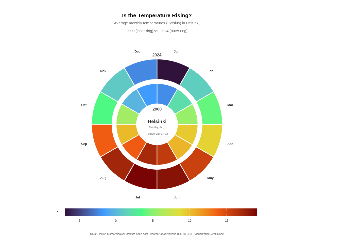
And there we have it, a fourth perspective on the Helsinki temperature data. Comparing the two rings, 2024 appears warmer across most months, particularly in summer and spring. The radial layout makes it easy to spot these seasonal patterns at a glance.
Geometric primitives aren’t something you’ll reach for every day. But when you need precise control over shapes and positions, such as in radial charts, custom annotations, and schematic diagrams, they’re invaluable. And as we’ve seen, coord_polar() isn’t the only way to think in circles.
3.4.2 ggdiagram
Before moving on from geometric shapes, I want to mention a relatively new package, ggdiagram (Schneider 2025). It provides an alternate way to produce many of them.
However, ggdiagram operates outside the ggplot2 paradigm and only uses it to plot the results, so we won’t go further into the package here. If you are interested in learning more, check out the package’s documentation.
3.5 Heatmaps
One way to visualize amounts is by using heatmaps. We can “map the categories onto the x and y axis and show amounts by color” (Wilke 2019).
For basic heatmaps, ggplot2 offers geom_bin_2d() and geom_hex(), which work well for showing the density or distribution of two continuous variables. But there’s a more specialized use case, visualizing daily time series data as a calendar, where those geoms don’t quite fit. For that, we can turn to ggTimeSeries (Kothari 2022).
3.5.1 Calendar heatmap
“A calendar heatmap is a great way to visualise daily data. Its structure makes it easy to detect weekly, monthly, or seasonal patterns” (Kothari 2022).
So let’s take a look at what we can do with the Helsinki daily temperature data we have already. Let’s first see what the data looks like for one year (2024) with just the mandatory parameters, cDateColumnName and cValueColumnName.
3.5.1.1 Viz #10: Helsinki temperatures, part V - ggTimeSeries
library(dplyr)
library(ggTimeSeries)
library(lubridate)

temperature_hki_2024 <- temperature_hki %>%
  filter(year == 2024) %>%
  mutate(date = paste(year, month, day, sep = "-") %>% as_date()) %>%
  select(date, avg_temperature_celsius, year)

ggplot_calendar_heatmap(
  temperature_hki_2024,
  cDateColumnName  = "date",
  cValueColumnName = "avg_temperature_celsius"
)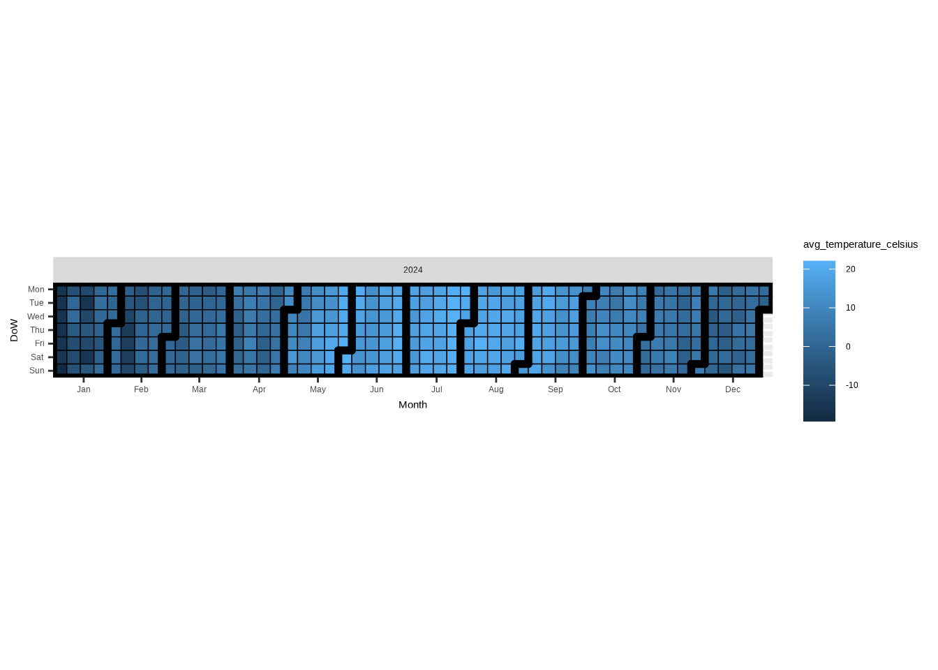
As you can see, the basic visualization is already quite neat. It’s interesting how, in addition to days and months, you also see the weekly structure.
However, the sequential color palette makes it hard to distinguish between positive and negative values. To make the chart more readable, we’ll switch to a diverging palette. After all, we have a range of values from positive to negative with a meaningful baseline (0) in the middle.
For the final version of the calendar heatmap, let’s use some more data. I would love to show all 25 years, but that version was perhaps too busy and having a 5 x 5 grid didn’t exactly make it easy to compare the years.
So, I decided to pick 5 years from 2004 to 2024 to show the possible change over time.
Show the code
library(dplyr)
library(ggplot2)
library(ggTimeSeries)
library(lubridate)

temperature_hki_cal <- temperature_hki %>%
  filter(year %in% c(2004, 2009, 2014, 2019, 2024)) %>%
  mutate(date = paste(year, month, day, sep = "-") %>% as_date()) %>%
  select(date, avg_temperature_celsius, year)

ggplot_calendar_heatmap(
  dtDateValue            = temperature_hki_cal,
  cDateColumnName        = "date",
  cValueColumnName       = "avg_temperature_celsius",
  vcGroupingColumnNames  = "year",
  dayBorderSize          = 0.1,
  dayBorderColour        = "grey30",
  monthBorderSize        = 0.8,
  monthBorderColour      = "grey30"
) +

  scale_fill_gradient2(
    low      = "#125184",
    mid      = "#ffffff",
    high     = "#F36523",
    midpoint = 0,
    name     = "°C"
  ) +

  facet_wrap(vars(year), ncol = 1) +

  labs(
    title    = "Average daily temperature (°C) in Helsinki",
    subtitle = "Every five years from 2004 to 2024",
    caption  = "Data: Finnish Meteorological Institute open data, weather observations (CC BY 4.0) | Visualization: Antti Rask",
    x        = NULL,
    y        = NULL
  ) +

  theme(
    axis.text.y       = element_blank(),
    axis.ticks        = element_blank(),
    legend.position   = "bottom",
    legend.text       = element_text(color = "grey30"),
    panel.background  = element_blank(),
    panel.border      = element_blank(),
    panel.grid        = element_blank(),
    plot.caption      = element_text(
      size  = 8,
      hjust = 0.5,
      color = "#777777"
    ),
    strip.background  = element_blank(),
    strip.text        = element_text(
      size  = 10,
      hjust = 0
    )
  )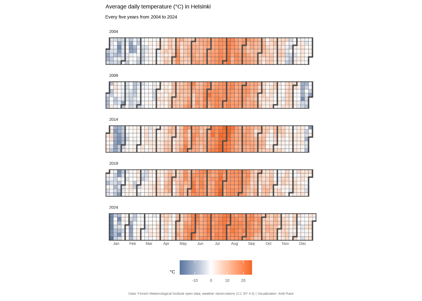
Calendar heatmaps are one of those chart types that feel almost obvious once you see one. Of course daily data should look like a calendar. The weekly rhythm jumps out immediately, and seasonal patterns become visible at a glance.
What I find most interesting is how much the color scale matters here. A sequential palette technically works, but switching to a diverging one transformed the chart from nice to informative.
It’s a good reminder that choosing the right color scale isn’t decoration! It’s an editorial decision about what story your data tells.
3.6 Intersection diagrams
Intersection diagrams, as the name suggests, are used to visualize intersecting data. Depending on your specific use case, you might want to choose either an UpSet diagram or a Venn diagram.
There is a fun Little Miss Data blog post (Ellis 2019) that pits the two against each other. But as you’ll find out by reading the blog (spoilers), the two are for very different purposes.
Let’s take a look at the two separately.
3.6.1 UpSet diagram
An UpSet diagram is perfect for visualizing intersecting sets. The basic version uses a matrix with rows “corresponding to the sets, and the columns to the intersections between these sets (or vice versa). The size of the sets and of the intersections are shown as bar charts” (Wikipedia contributors 2026a).
There are many R packages for creating UpSet diagrams, but for this book, we’ll use ggupset (Ahlmann-Eltze 2025). It’s the most compatible with the ggplot2 syntax.
But let’s start with the data. We’ll use the IMDb data once more. ggupset prefers the data in a specific format. We need to reshape the wide genre columns into a single list column, genres, that holds one or more values per film.
Let’s again start with the most simple version of the UpSet diagram. The only function we need for that is the scale_x_upset().
library(ggplot2)
library(ggupset)

ggplot(movies_ggupset) +
  geom_bar(aes(genres)) +
  scale_x_upset() +
  scale_y_continuous(
    breaks = seq(0, 12500, by = 2500),
    name   = NULL
  )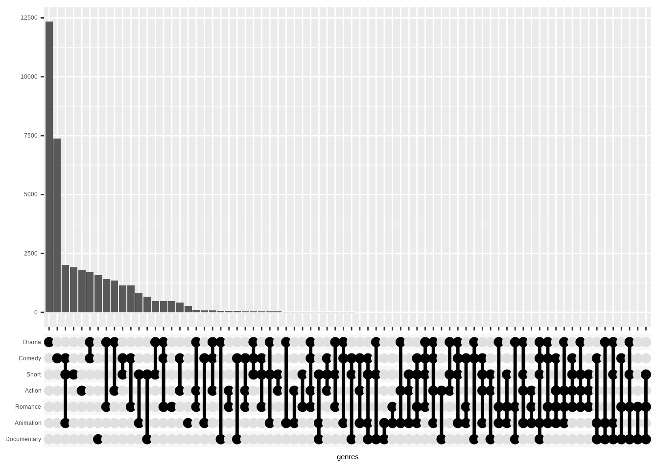
Now, it’s mostly working as is. But as you can see, we have genre combinations with no or very few films attached.
That’s where the n_intersections parameter comes in. We’ll use it to show only n combinations with the most values. Top 20 in this case.
ggplot(movies_ggupset) +
  geom_bar(aes(genres)) +
  scale_x_upset(n_intersections = 20) +
  scale_y_continuous(
    breaks = seq(0, 12500, by = 2500),
    name   = NULL
  )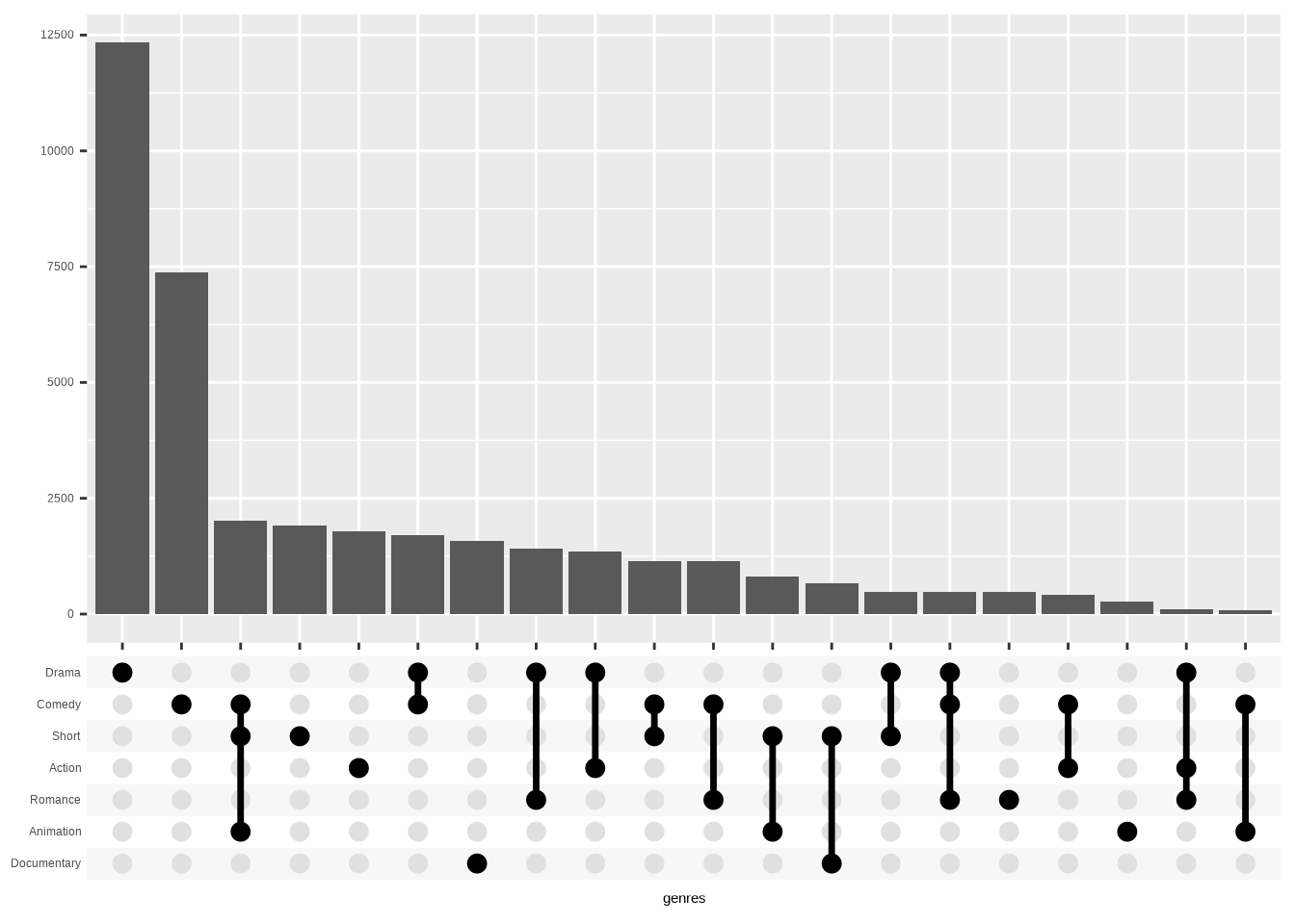
Before creating the final version of this, I wish to highlight one alternative. As you know, there are many ways to order the data. And if you’d like to have them first ordered by the number of combined genres, you can use the order_by = “degree” argument.
ggplot(movies_ggupset) +
  geom_bar(aes(genres)) +
  scale_x_upset(
    n_intersections = 20,
    order_by        = "degree"
  ) +
  scale_y_continuous(
    breaks = seq(0, 12500, by = 2500),
    name   = NULL
  )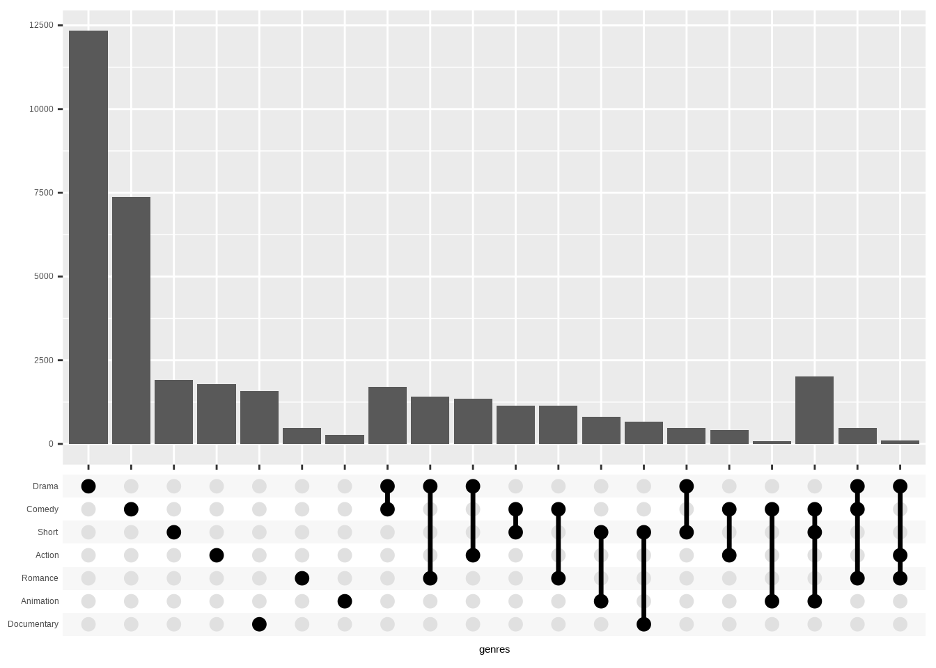
There might be situations where this is useful. But for the final version of the visualization here, let’s leave that parameter out.
3.6.1.1 Viz #11: IMDb movies, Part IV - ggupset
At this point it’s mostly cleaning up that we need for the final version. Besides the regular ggplot2 theming, we use theme_combmatrix() to make the matrix look good.
Show the code
library(ggplot2)
library(ggupset)

ggplot(movies_ggupset, aes(genres)) +
  geom_bar(fill = "#40E0D0") +
  scale_x_upset(n_intersections = 20) +
  scale_y_continuous(
    limits = c(0, 12500),
    breaks = seq(0, 12500, by = 2500),
    name   = "",
    expand = c(0, 0)
  ) +
  theme_minimal() +
  # Style the matrix panel (dots, lines, labels)
  theme_combmatrix(
    combmatrix.label.make_space       = FALSE,
    combmatrix.panel.line.color       = "#FE5F00",
    combmatrix.panel.line.size        = 1,
    combmatrix.panel.point.color.fill = "#FE5F00"
  ) +
  theme(
    panel.grid.major.x = element_blank(),
    panel.grid.major.y = element_line(
      color     = "#141204",
      linewidth = 0.1
    ),
    panel.grid.minor   = element_blank(),
    plot.margin        = margin(5, 5, 5, 20),
    plot.title         = element_text(margin = margin(10, 0, 5, 0)),
    plot.subtitle      = element_text(
      color  = "gray40",
      margin = margin(0, 0, 20, 0)
    ),
    plot.caption       = element_text(
      size   = 8,
      color  = "#777777",
      hjust  = 0.5,
      margin = margin(10, 0, 0, 0)
    )
  ) +
  labs(
    title    = "Why be only a Drama or a Comedy when you can be both?!",
    subtitle = "Genre combinations for movies in the 20th century",
    caption  = "Data: IMDb movies (1893-2005) via {ggplot2movies} | Visualization: Antti Rask",
    x        = NULL
  )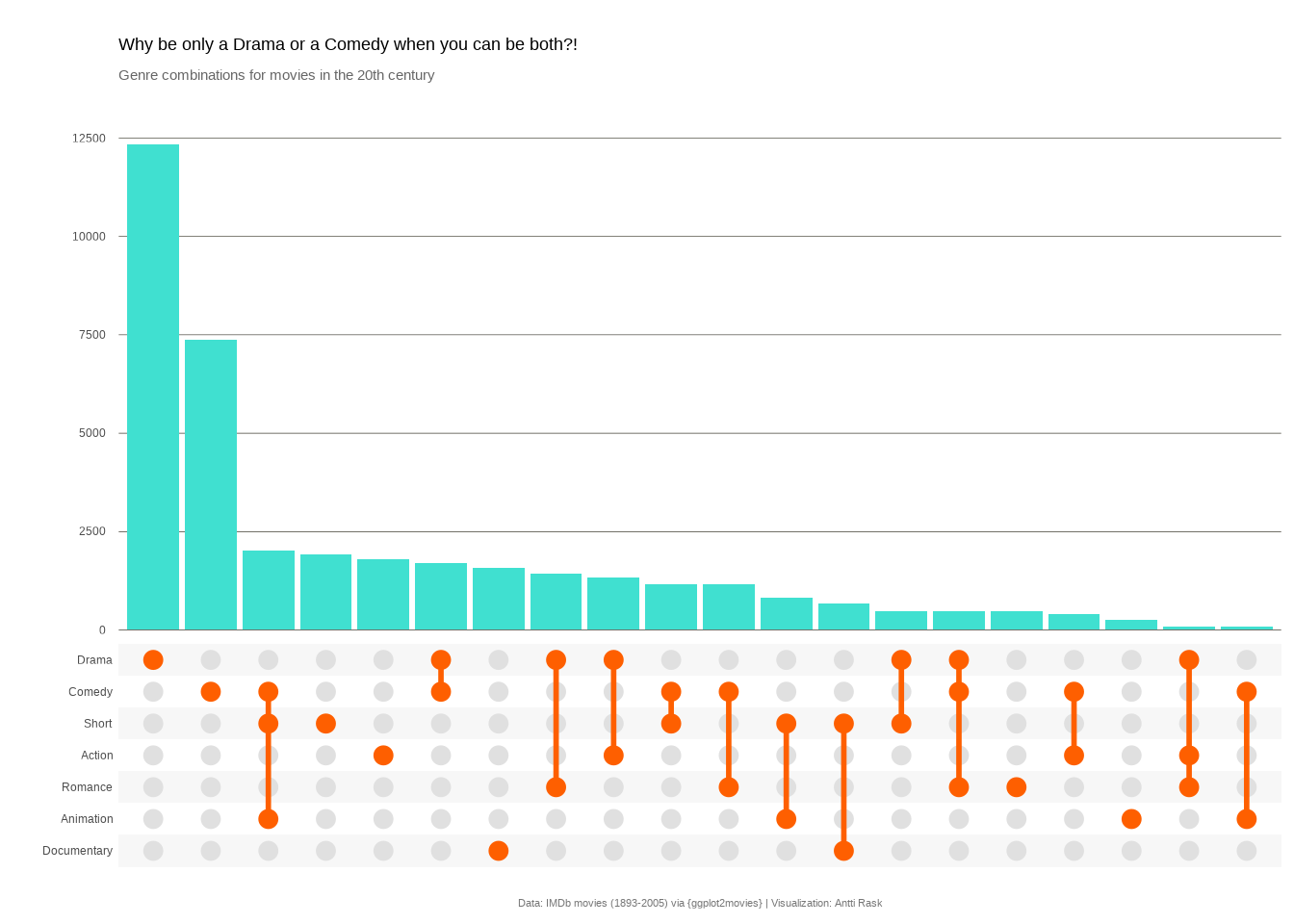
We used ggupset here because it plays nicely with the ggplot2 grammar: you build a bar chart and swap in scale_x_upset(). That simplicity is its strength.
If you need more power, annotation panels, built-in queries, or custom intersection-level plots, take a look at ComplexUpset (Krassowski 2021). It wraps UpSet plots in full ggplot2 while adding those features. Note! As of this writing, it has compatibility issues with ggplot2 4.0.0+.
And if you prefer a more self-contained approach, UpSetR (Gehlenborg 2019) is the original R implementation. It uses ggplot2 internally, but wraps everything in a single function call with its own parameters rather than exposing a ggplot object you can layer onto.
3.6.2 Venn diagram
A Venn diagram has been around for a while to show “the logical relation between sets, popularized by John Venn (1834–1923) in the 1880s” (Wikipedia contributors 2026b).
It works similarly to the UpSet diagram, but can accommodate only so many sets. ggVennDiagram (Gao and Dusa 2026) comes with a function plot_shapes() for plotting the available shapes. In some cases you can then choose which variation of a shape to use.
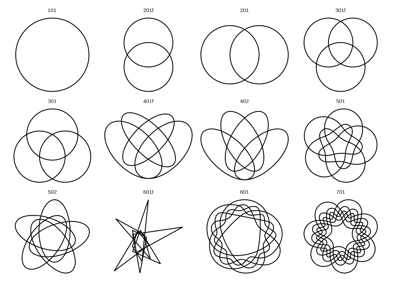
We can also take a look at the different shapes as a tibble:
get_shapes()# A tibble: 12 × 3
shape_id nsets type
<chr> <int> <chr>
1 101 1 circle
2 201f 2 circle
3 201 2 circle
4 301f 3 circle
5 301 3 circle
6 401f 4 ellipse
7 402 4 polygon
8 501 5 polygon
9 502 5 polygon
10 601t 6 triangle
11 601 6 polygon
12 701 7 polygon As you can see, seven seems to be the greatest number of sets. But let’s take a look at a real use-case where we can also test those limits.
3.6.2.1 Viz #12: IMDb movies, Part V - ggVennDiagram
For this, let’s revisit the IMDb movies data set. We’ll first limit the number of sets to three, Comedy, Drama, and Romance. What we want for ggVennDiagram is a list that has three levels, one for each genre.
Let’s then try the ggVennDiagram() function with the default settings.
library(ggVennDiagram)

ggVennDiagram(genre_sets)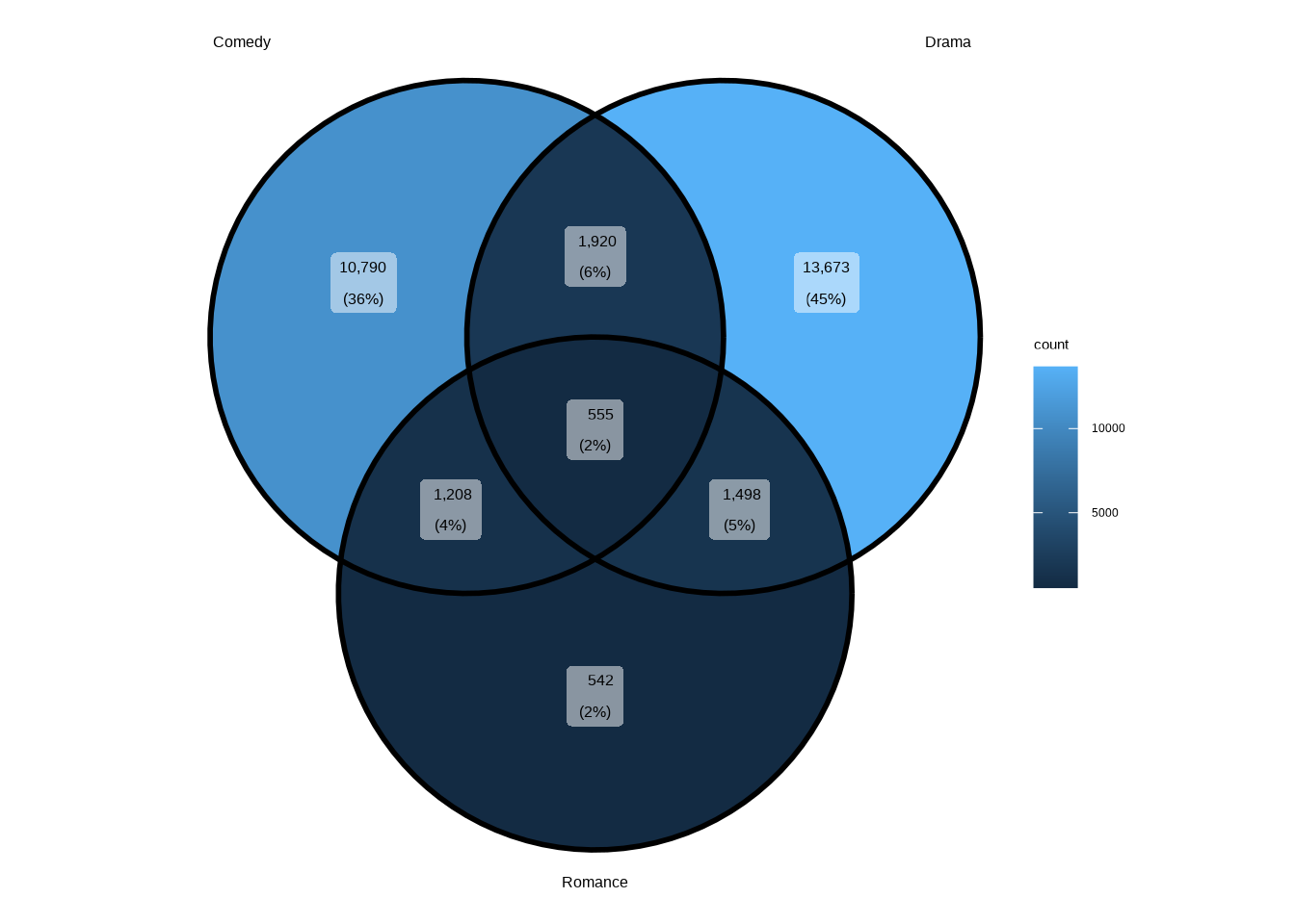
That already looks pretty good. But what if we had more sets, more genres? Let’s try the same, with the same number as for the UpSet diagram earlier.
ggVennDiagram(genre_sets_all)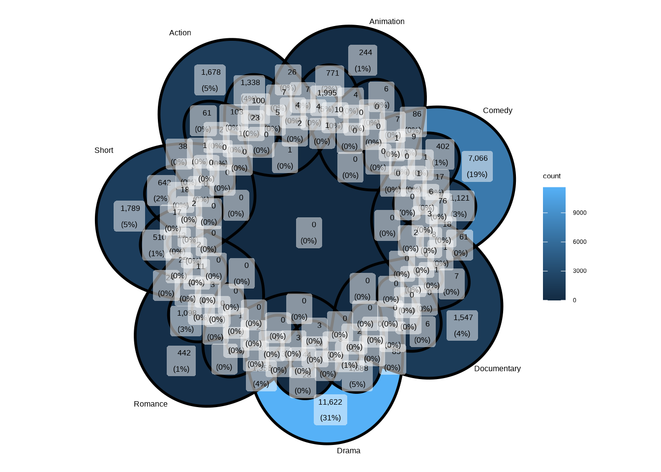
As you can see, that’s not the best way to visualize this data. Even if we turned off the annotations, it would still be much more confusing compared to the UpSet plot.
And if we had even one more set, ggVennDiagram would actually fall back to plotting an UpSet plot instead! That’s how close the two are to each other philosophically.
Let’s now create a more visually appealing visualization with only the three genres. Let’s use all the parameters that make sense: edge_size for thinner lines, label = “count” to show only counts, label_alpha = 0 to hide the label background, and label_color = “#ffffff” to make the label text white.
Show the code
library(ggplot2)
library(ggVennDiagram)
library(stringr)

ggVennDiagram(
  genre_sets,
  edge_size    = 0.5,
  label        = "count",
  label_alpha  = 0,
  label_color  = "#ffffff"
) +

  scale_fill_gradient(
    low  = "#78a9ff",
    high = "#001d6c"
  ) +

  # Extra horizontal padding so the outer set labels don't get clipped
  scale_x_continuous(expand = expansion(mult = 0.1)) +

  theme(
    legend.position = "none",
    plot.title      = element_text(
      hjust  = 0.5,
      margin = margin(20, 0, 5, 0)
    ),
    plot.subtitle   = element_text(
      color  = "gray40",
      hjust  = 0.5,
      margin = margin(0, 0, 20, 0)
    ),
    plot.caption = element_text(
      size   = 8,
      color  = "#777777",
      hjust  = 0.5,
      margin = margin(10, 0, 5, 0)
    ),
    plot.margin = margin(0, 20, 0, 0)
  ) +

  labs(
    title    = "Drama Is the Loneliest Genre",
    subtitle = str_glue(
      "The number of films in each genre
      combination in 20th century films"
    ),
    caption  = str_glue(
      "Data: IMDb movies (1893-2005)
      via ggplot2movies | Visualization: Antti Rask"
    )
  )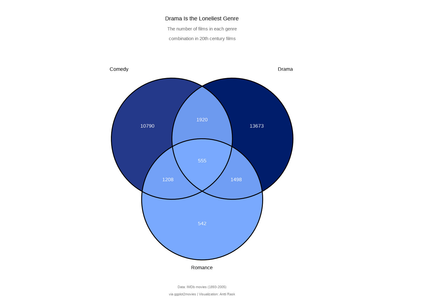
A Venn diagram makes overlaps intuitive at a glance. You can immediately see that Drama has the largest exclusive slice, or that Comedy and Romance share more films than you might expect. That’s something the UpSet diagram’s bar-and-matrix layout doesn’t communicate as viscerally.
But the trade-off is clear. Three sets are comfortable, four are manageable. Beyond that, it falls apart fast, as the seven-genre version demonstrated. That’s not a weakness of ggVennDiagram, but a fundamental limitation of the format. When your sets outgrow the diagram, that’s your cue to reach for an UpSet plot instead.
If you want a lighter alternative, ggvenn (Yan 2025) offers a single geom_venn() that plugs straight into a ggplot call. It’s less customizable but gets the job done for quick two- or three-set diagrams.
3.7 Line charts
Line charts are the bread and butter of data visualization. And as with bar charts, ggplot2 handles most types out of the box. And as with bar charts, there are specific use cases for these more specialized line charts.
In this section, we’ll take a look at the bump chart, the dumbbell and lollipop chart, the line chart with neon glow or shadow effects, and the slope chart.
3.7.1 Bump chart
A bump chart is a type of line chart used to visualize changes in rankings of categorical data over time. To create one, we’ll use the extension ggbump (Sjoberg 2026).
We’ll once again use the IMDb movie dataset. This time, we’ll summarize the data by genre and decade, starting from the 1930s. Before that, some genres have only a handful of films, making average ratings unreliable.
3.7.1.1 Viz #13: IMDb movies, Part VI - ggbump
library(dplyr)
library(tidyr)

movies_ggbump <- movies_na %>%
  pivot_longer(Action:Short, names_to = "genre") %>%
  filter(value != 0) %>%
  filter(decade %in% seq(1930, 2000, 10)) %>%
  summarize(
    rating_avg = mean(rating),
    .by        = c(genre, decade)
  ) %>%
  mutate(
    rank = rank(-rating_avg, ties.method = "first"),
    .by  = decade
  ) %>%
  arrange(decade, rank)
Let’s start with the basic version with default settings.
We can already see what the chart is about. The movie genres are in the ranking order, but the order is upside down. Next, let’s fix that and make other changes to make the chart more presentable.
We’ll add the points first. They act as anchors for the viewer’s gaze. Then we’ll add the genres using geom_text(). Direct labeling is a nice touch and more intuitive than using a legend.
In this book, color as a storytelling tool is a recurring theme. And it was a conscious storytelling decision to highlight the Documentaries genre. We can use scale_color_manual() to specify only one genre’s color, while ggplot2 uses its default palette for the rest.
Finally, we need to fix the ranking order using scale_y_reverse().
Show the code
library(ggbump)
library(ggplot2)

movies_ggbump %>%

  ggplot(aes(decade, rank, color = genre)) +

  geom_point(size = 5) +

  geom_text(
    aes(
      x     = decade - 2,
      label = genre
    ),
    data     = movies_ggbump %>% filter(decade == min(decade)),
    size     = 4,
    hjust    = 1,
    fontface = "bold"
  ) +

  geom_text(
    aes(
      x     = decade + 2,
      label = genre
    ),
    data     = movies_ggbump %>% filter(decade == max(decade)),
    size     = 4,
    hjust    = 0,
    fontface = "bold"
  ) +

  geom_bump(
    linewidth = 1.2,
    smooth    = 8 # higher = smoother curves
  ) +

  scale_color_manual(values = c("Documentary" = "#CC4C00")) +

  scale_x_continuous(
    breaks = seq(1930, 2000, 10),
    # Extra horizontal padding on both sides for the direct labels
    expand = expansion(mult = c(0.15, 0.15))
  ) +

  scale_y_reverse() +

  labs(
    title    = "Documentaries Are the Best",
    subtitle = "Genres ranked by their average IMDb rating",
    caption  = "Data: IMDb movies (1893-2005) via ggplot2movies | Visualization: Antti Rask",
    x        = NULL,
    y        = NULL
  ) +

  theme_minimal() +

  theme(
    axis.text.x      = element_text(size = 10),
    axis.text.y      = element_blank(),
    legend.position  = "none",
    plot.title       = element_text(
      face  = "bold",
      hjust = 0.5
    ),
    plot.subtitle    = element_text(
      hjust  = 0.5,
      margin = margin(0, 0, 10, 0)
    ),
    plot.caption     = element_text(
      hjust  = 0.5,
      color  = "#777777",
      size   = 9,
      margin = margin(20, 25, 0, 25)
    ),
    panel.grid.major = element_blank(),
    panel.grid.minor = element_blank(),
    plot.margin      = margin(20, 0, 10, 0)
  )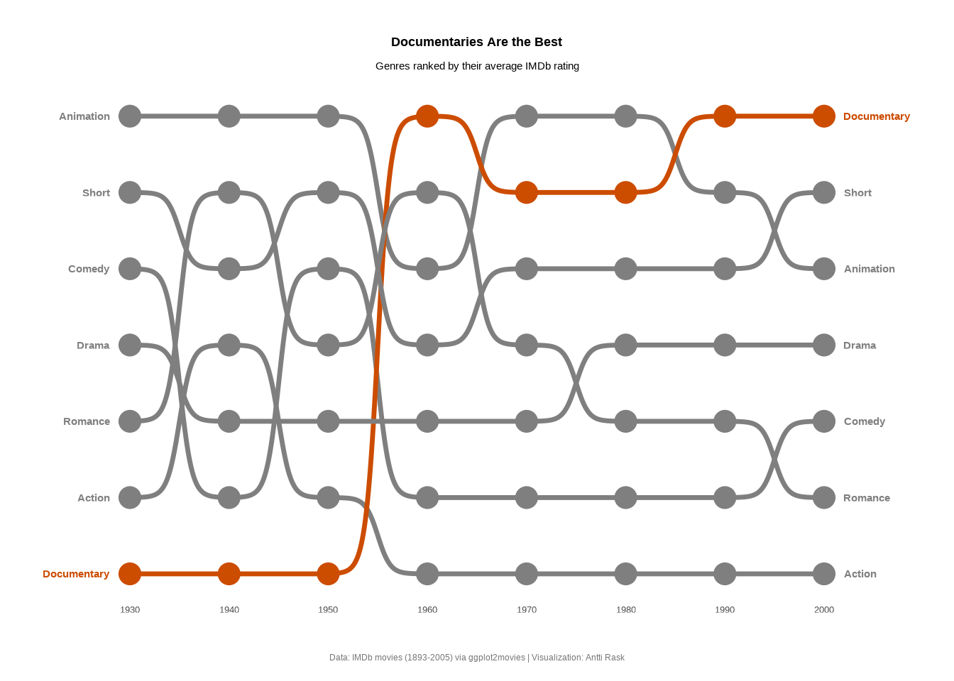
We made some bold choices, but now we have a chart that tells one of the stories buried within the data. Bump charts work best when you have a handful of categories competing across discrete time steps, and you care about relative position rather than absolute values.
The ranking abstraction strips away the noise and lets the audience focus on who’s rising and who’s falling. And in this case, the answer is clear.