# Load required libraries
library(gganimate)    # For creating animated ggplot visuals
library(ggplot2)      # Core plotting library

# Animate the ridgeline plot across different years
plot_animated <- plot_ggridges +
  transition_states(
    # Animate over the 'year' variable
    year,
    # Duration of transitions between states (in frames)
    transition_length = 10,
    # Duration each state (year) is held on screen
    state_length      = 4
  ) +

  # Smooth fade-in for each year's frame
  enter_fade() +

  # Smooth fade-out when switching years
exit_fade()13 Animated plots
WarningThis book/site is under construction
Everything is liable to change, even the title
Animated data visualizations incorporate motion to convey information. Unlike static charts, animated visuals show change dynamically. For example, a bar growing to represent an increasing value, or points moving on a map to show a shifting geographic pattern.
Animation can make data stories more engaging and help audiences grasp transitions or trends that unfold over time. However, using animation requires understanding when it aids comprehension and when it might hinder it.
ggplot2 (Wickham et al. 2026) out of the package doesn’t come with animation capabilities. In this chapter, we’ll see how different packages have approached the challenge.
13.1 camcorder
13.2 gganimate
Using gganimate (Pedersen and Robinson 2025) is a nice, easy way to animate your visualizations. You can always start with a static visualization and add the animation elements. It “extends the grammar of graphics as implemented by ggplot2 to include the description of animation. It does this by providing a range of new grammar classes that can be added to the plot object in order to customise how it should change with time.”
Of course, we need to render the animation somehow. We’ll be using the default, gifski (Ooms et al. 2025), but it’s good to know that there are other options available.
13.2.0.1 Viz #n: Helsinki temperatures, part n
For this example, we’ll be revisiting the Helsinki temperatures visualization from Section 3.3.2.1. Since you can revisit that section, we’ll only go through what needs to be added for the animation.
The original static visualization showed monthly temperature data for 2024. What we’d like to see is the same, but for each year between 2000 and 2024. Starting with the data, the only change we need to make is to remove the year filter and include the year as a column.
Similarly, for the ggplot2 code, there are only two small changes that need to be made. We’ll save the ggplot object as plot_ggridges. And we’ve added the argument subtitle = “Year: {closest_state}” inside the labs() function. That’s it.
Starting with the plot_ggridges we can now add the animation layer. We’ll do this in three easy steps:
-
transition_states()defines how the data should be spread out and how it relates to itself across time -
enter_fade()defines how new data should appear… - …and
exit_fade()defines how old data should disappear during the course of the animation (Pedersen and Robinson 2025)
Now that we have the animated plot in plot_animated, we still need to do the rendering. We select the number of frames, frames per second, width, height, and, finally, the renderer.
animate(
  # Use the animated plot object defined earlier
  plot      = plot_animated,
  # Total number of frames in the animation
  nframes   = 300,
  # Frames per second → total duration = 60 seconds
  fps       = 5,
  # Width of the output GIF in pixels
  width     = 800,
  # Height of the output GIF in pixels
  height    = 600,
  # Save output as a GIF to specified file path
  renderer  = gifski_renderer("img/figure-13-1.gif")
)
Compared to many other things, rendering will take some time. This one took 59.80 seconds. So it’s still not that bad, even if it’s a lot compared to a static visualization. I wanted to add enough frames so that you have time to see what’s happening in the chart.
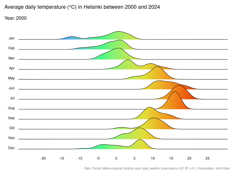
I would say that this animation falls under the category of “help audiences grasp transitions or trends that unfold over time”.