data(WorldPhones)2 Data
Things are still liable to change…
2.1 Data sets
This book is about tools for creating visualizations. But to visualize data you first need data. So let’s start by taking a look at some of the data sets available to us without much hassle.
2.1.1 base R
Base R comes with a bunch of data sets ready to use. There are classics like iris and mtcars, but there are many more to choose from.
Since the datasets package comes from base R, the data is not always immediately ready to use with ggplot2 (Wickham, Chang, et al. 2026). Luckily we have the tidyverse (Wickham 2023) packages that make it easy to make the necessary changes.
Here is an example using the WorldPhones (‘The World’s Telephones’) data set. We can start by loading the data set by using the data() function.
Let’s take a quick look at what the first couple of rows of the data set looks like.
head(WorldPhones) N.Amer Europe Asia S.Amer Oceania Africa Mid.Amer
1951 45939 21574 2876 1815 1646 89 555
1956 60423 29990 4708 2568 2366 1411 733
1957 64721 32510 5230 2695 2526 1546 773
1958 68484 35218 6662 2845 2691 1663 836
1959 71799 37598 6856 3000 2868 1769 911
1960 76036 40341 8220 3145 3054 1905 1008WorldPhones is a matrix with 7 rows and 8 columns. The columns give the figures for a given region, and the rows the figures for a year. We would like to turn it into a tidy format. We can use the tibble (Müller and Wickham 2026) package for the first part. And then we’ll use pivot_longer() from the tidyr package (Wickham et al. 2025). It increases the number of rows and decrease the number of columns. We want the continents to be observations, not columns.
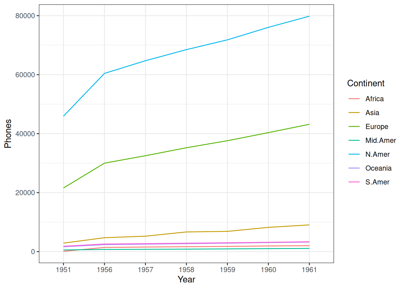
What we’re left with is a tibble with three columns, Year, Continent, and Phones. We can then use the new tibble to create a simple graph with ggplot2.
2.1.2 IMDb movies (1893-2005)
ggplot2movies (Wickham 2015) used to be a part of the ggplot2 package itself. It’s now its own package to make ggplot2 lighter.
But it’s a cool little package. It has Internet Movie Database (IMDb) data about movies from between 1893 and 2005. The selected movies have “a known length and had been rated by at least one [IMDb] user.” (Wickham 2015).
The Movies data set has qualities that make it good for our needs. Let’s start by loading it.
Let’s take a quick look at what some of the data looks like.
head(movies)Movies is already a tibble. It consists of 58788 rows (observations) and 24 columns (variables).
When starting to work with a new data set it’s always good to take a look at the documentation. To understand what is in those rows and columns (and what is not).
Here are some of the reasons why Movies is a good example data set because it includes:
- A goldilocks amount of data. Not too little, not too much
- Categorical data of both nominal (title, genre) and ordinal (mpaa) kind
- Numerical data of both continuous (budget, length, rating) and discrete (year, votes) kind
We can use two of those columns, year and rating to create a simple visualization with ggplot2.
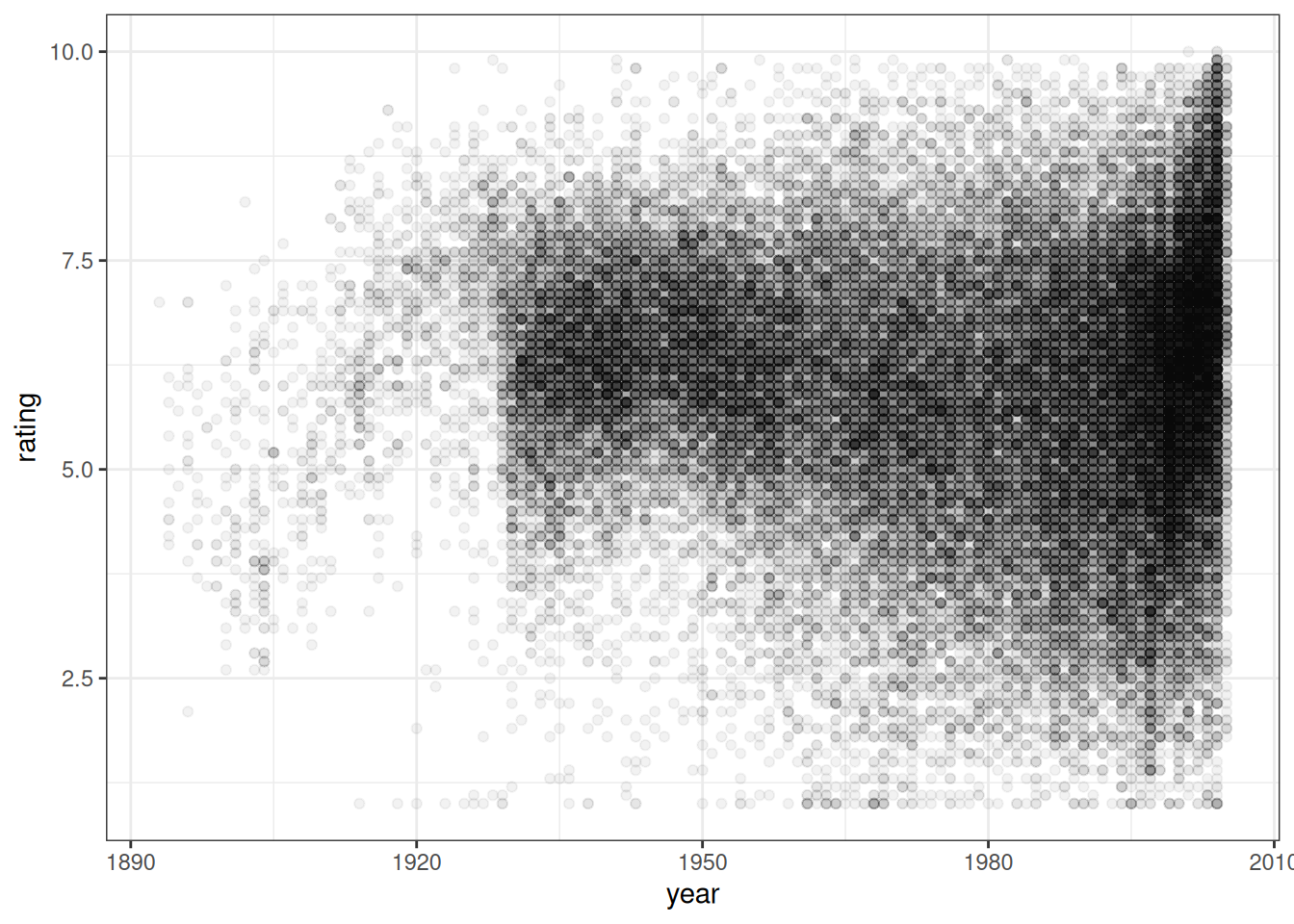
As mentioned earlier, Movies is already a tibble. But, it doesn’t mean that the data is in an optimal format for all kinds of visualization. But we’ll do all the necessary data wrangling within the chapter where we use the data.
2.1.3 RDatasets
RDatasets is not an R package. But it is an excellent GitHub repo. And a “collection of data sets originally distributed in various R packages” (Arel-Bundock 2025).
Here listed are the 2337 data sets that were available on 2024-11-11.
The RDatasets repo contains that same list. But there you will also find a .csv file and documentation for each data set.
If I had to choose one fun data set from the list to highlight, it would be starwars from the dplyr (Wickham, François, et al. 2026) package.
You can choose to use the .csv file provided on the website. Another way to use the collection is to choose the data set from the list and load the package it comes with:
Let’s take a quick look at what some of the starwars data looks like.
head(starwars)There are a bunch of Star Wars characters and their stats.
Let’s choose two columns, height and species (and filter for six of the more well-known species). We’ll use them to create a simple visualization with ggplot2.
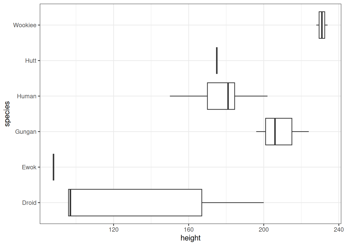
This concludes the section about the different data sets available for every R user. Next, we’ll take a look at some of the ggplot2 extensions that make it easier to do exploratory data analysis (EDA).
2.2 Exploratory data analysis (EDA)
Exploratory data analysis (or EDA, which we’ll be using from now on) is a process, even if it is a loose one. The Cambridge Dictionary ((Ed.) 2013) defines process as “a series of actions that you take in order to achieve a result”. So, we a) have a series of actions and b) a result you wish to achieve.
Let’s look at the results first. After all, that is why we do things. You might have other, more specific goals depending on your particular field or use case. But in the most general sense, the result we’re after is a better understanding of the data (set) we’re working on.
What are the series of actions we need to take? As I mentioned earlier, EDA is a loose process. There are as many ways to go about it as there are analysts and data sets. Still, some common steps usually occur: looking at missing values, summarizing data, and visualizing relationships between variables.
It’s good to note these visualizations aren’t usually meant for publication. Compared to those you find later on in the book, these are more for your eyes than for the eventual audience.
The last thing we’ll look at in this chapter is one way to automate the EDA process using an app. Although I must warn you. It’s better to use these tools only after you’ve gained experience from doing EDA without them. It might sound counter-intuitive, but trust me. It can be too overwhelming if you don’t know what you’re doing.
2.2.1 Missing values
Let’s first load the data. Looking at the movies data set earlier we noticed the mpaa column had many blank values. We don’t know if they didn’t have a rating in the first place. Or if they did, but the rating is missing. For the sake of this demonstration, let’s assume they all should have a rating.
We’ll begin by turning all the blank values (of the character type) into NA (not available).
Naniar (Tierney et al. 2024) is a package with many functions for visualizing missing (NA) values. It does contain many functions outside of visualization. But that’s for another book.
One simple function is gg_miss_var(). It creates a lollipop chart (see Section 3.7.2). It shows which columns (variables) contain the greatest amount of missing (NA) values.
library(naniar)

movies_na %>%
  gg_miss_var() +
  theme_bw()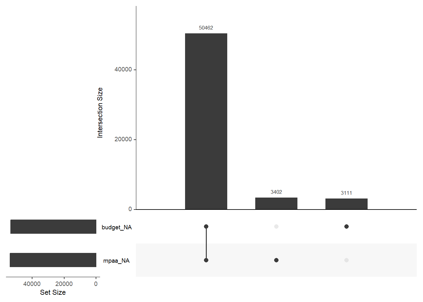
We can see that MPAA ratings aren’t the only thing missing. Almost the same amount of films are missing the budget information. With budget, it’s easier to say that if we don’t have a number, it is missing. Then again, that column did have NAs in place from the beginning.
We’re also interested in seeing if there is overlapping missingness between the columns. It can indicate patterns in the data. We’ll use an UpSet diagram (see Section 3.6.1) for that. Just add gg_miss_upset().
movies_na %>%
  gg_miss_upset(
    # Number of sets to look at. We know there are only two columns with NA
    nsets = 2
  )
Warning: `aes_string()` was deprecated in ggplot2 3.0.0.
ℹ Please use tidy evaluation idioms with `aes()`.
ℹ See also `vignette("ggplot2-in-packages")` for more information.
ℹ The deprecated feature was likely used in the UpSetR package.
Please report the issue to the authors.Warning: Using `size` aesthetic for lines was deprecated in ggplot2 3.4.0.
ℹ Please use `linewidth` instead.
ℹ The deprecated feature was likely used in the UpSetR package.
Please report the issue to the authors.Warning: The `size` argument of `element_line()` is deprecated as of ggplot2 3.4.0.
ℹ Please use the `linewidth` argument instead.
ℹ The deprecated feature was likely used in the UpSetR package.
Please report the issue to the authors.
More than 3000 movies without an MPAA rating and almost the same amount without a budget. But over 50000 without both. That makes me think there is a consistency in the missingness.
We can also use geom_miss_point() to see if there are more patterns between the missing variables. Let’s also use label_number() from the scales (Wickham et al. 2023) package to prettify the x-axis labels.
library(ggplot2)
library(scales)

p1 <- movies_na %>%
  ggplot(aes(budget, mpaa)) +
  geom_point() +
  geom_miss_point() +
  scale_x_continuous(
    labels = label_number(
      scale  = 1e-6,
      prefix = "$",
      suffix = "M"
    )
  ) +
  theme_bw()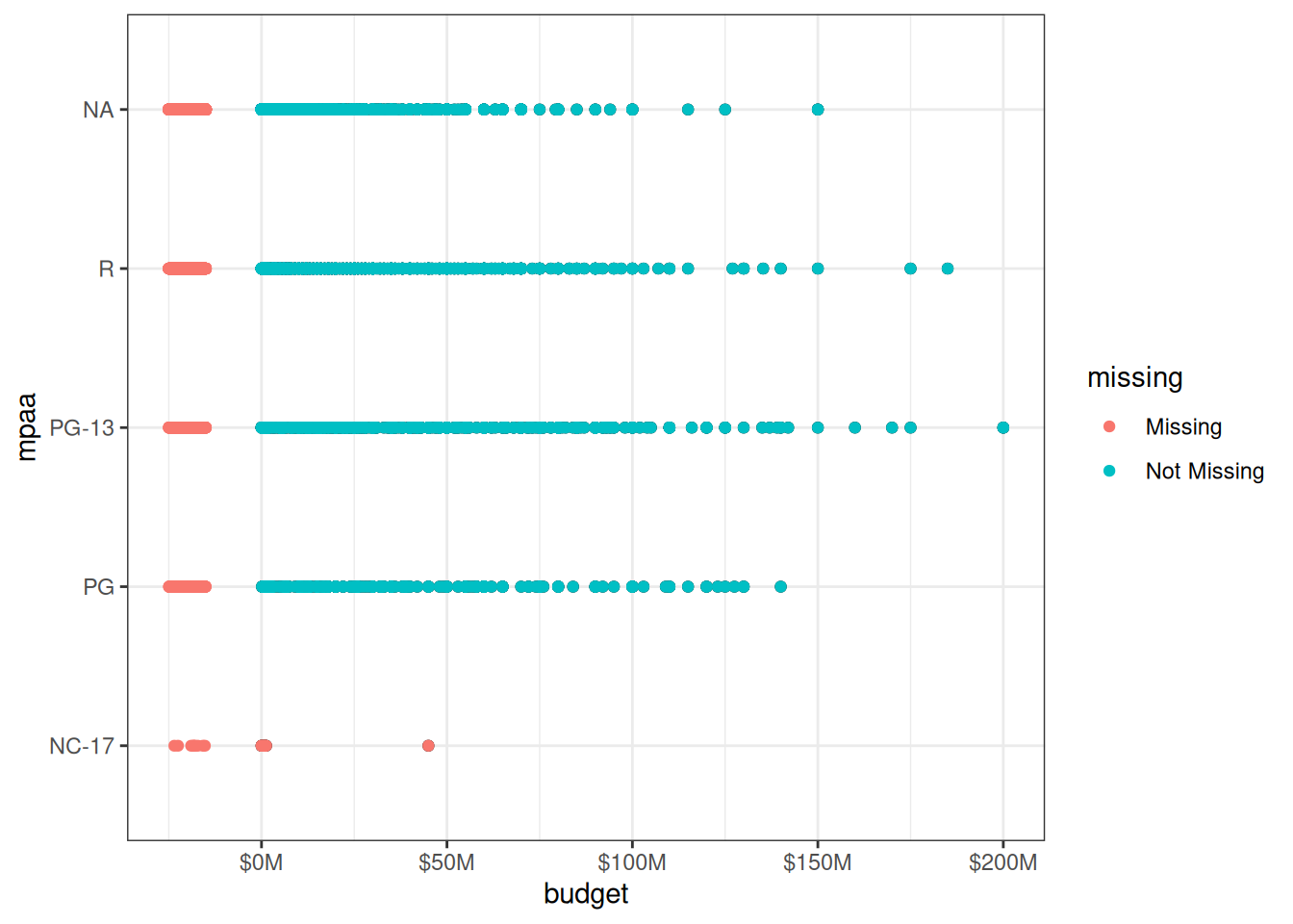
Values seem to be missing in all the MPAA rating categories. NC-17 does not seem to contain that many values in general, but many of them seem to be missing.
Let’s confirm this observation by creating a frequency table with the tabyl() function. It’s from a neat package called janitor (Firke 2024).
So, there are more NC-17 movies that are missing the budget than those that aren’t.
We can dig even deeper. We can use facet_wrap() from ggplot2 to see how the missing values are distributed throughout the history.
p1 +
  scale_x_continuous(
    n.breaks = 3,
    labels   = label_number(
      scale  = 1e-6,
      prefix = "$",
      suffix = "M"
    )
  ) +
  facet_wrap(vars(decade))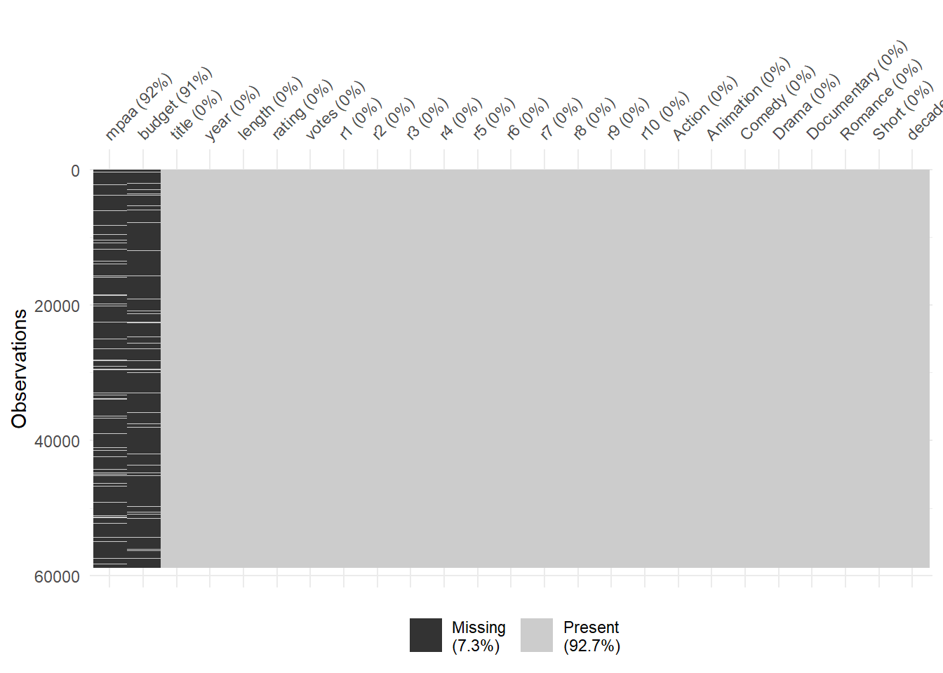
Before moving on, let’s first look at one alternative for visualizing missing values, plot_missing(). It comes from the DataExplorer (Cui 2026) package.
library(DataExplorer)

movies_na %>%
  plot_missing(
    # Let's only visualize the missing values
    missing_only = TRUE,
    # We'll use theme_bw() when possible
    ggtheme      = theme_bw()
  )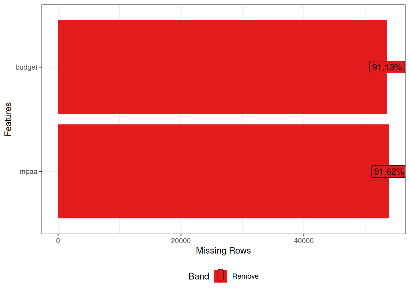
You see the amount and percentage of NAs per column, arranged in order of missingness. This is a great quick overview!
DataExplorer, like naniar earlier, provides functions for handling the missing values. For instance, we could drop the budget and mpaa columns, as indicated by the red color in the above plot.
2.2.2 Summarizing data
Of course, we want to visualize more than the missing data. It makes sense to start with an overview of some kind.
Luckily we don’t have to go further than the DataExplorer package. You know, the one we already tried in the previous chapter.
We’ll start with the plot_intro() function. It gives us some basic information about our data set, visualized.
library(DataExplorer)
library(dplyr)

movies_na %>%
  plot_intro(ggtheme = theme_bw())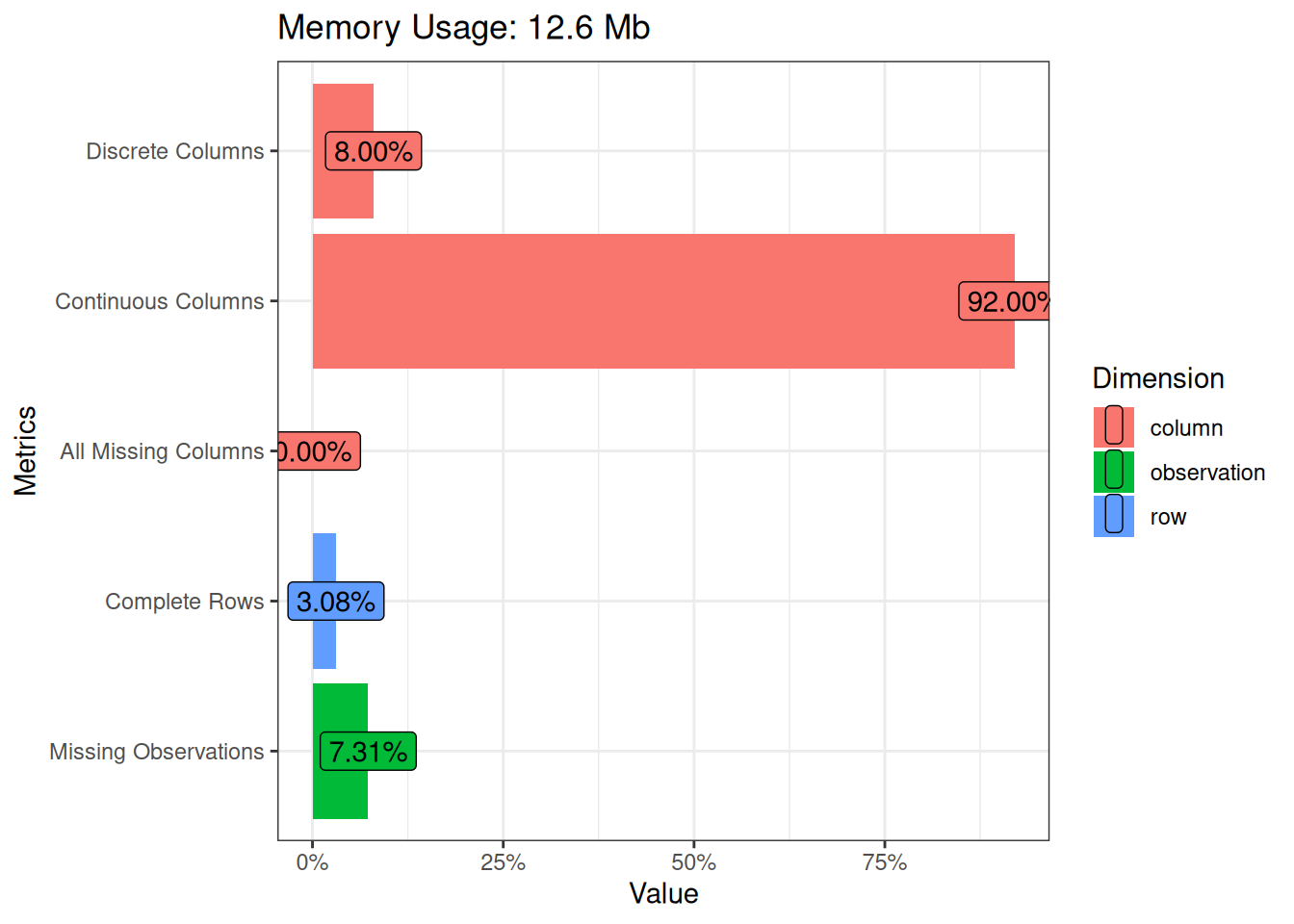
2.2.2.1 Missing Values
The most fascinating insights here are still related to missing values. Less than 5% of the rows in the data set are complete. Meaning that they have no missing values in any of the columns. And almost 10% of all the observations are missing. That’s how much the missing rows of budget and mpaa are affecting the totals. One positive thing is that we don’t have any columns that are missing all the values.
2.2.2.2 Categorical Columns
Let’s then take a look at the categorical columns. The one that will be missing from the upcoming visualizations is title. The values are more or less unique. So, it wouldn’t make sense having a bar chart, for instance, with more than 50000 rows with a count of 1 each.
Did someone mention bar charts? Let’s start with the plot_bar() function to visualize the categorical columns. This will show us what the frequency of each of the values are within a column.
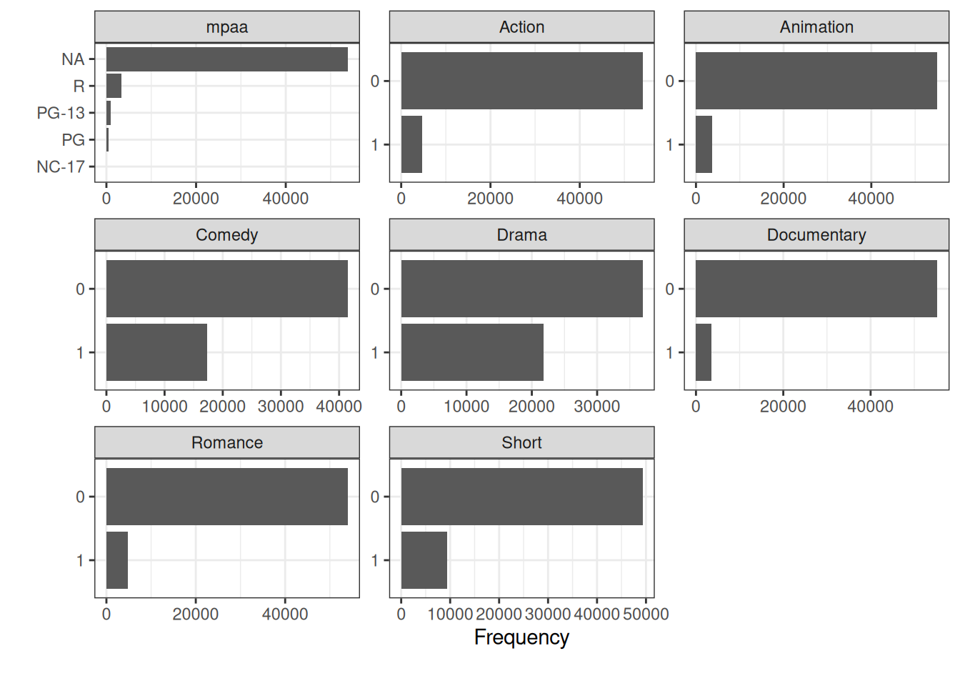
We see mpaa with it’s missing values. The rest of the categorical columns are binary ones about which genres each movie belongs to. Comedy and Drama seem to be the best represented ones in the data set.
With the with argument we can choose to show something else on the x-axis besides the frequency. Here, for instance, we’ve chosen length to be the column to sum up.
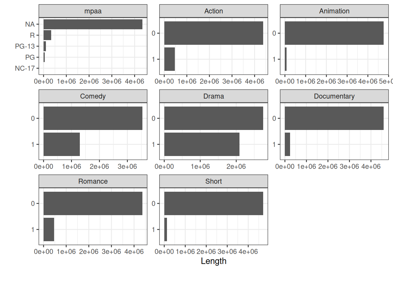
Here we can see that Animation and Short make up an even smaller part of the whole as before. Which makes sense, when you start to think about it.
Another useful feature is using the by argument. It means we will see the frequency broken down by a discrete feature. In this case we’ve chosen mpaa.
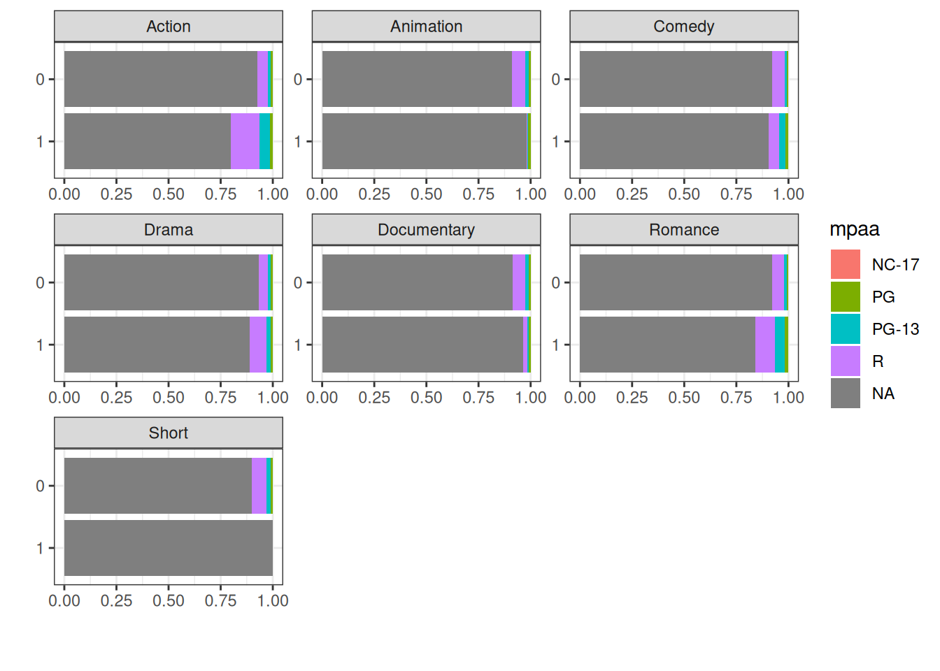
This shows us that Action and Romance are the genres with more R rated movies than the other genres. Of course we must remember the prevalence of those missing values.
2.2.2.3 Numerical Columns
Next, we’ll use plot_histogram() to draw a histogram of all the numerical columns (both discrete and continuous).
movies_na %>%
  plot_histogram(ggtheme = theme_bw())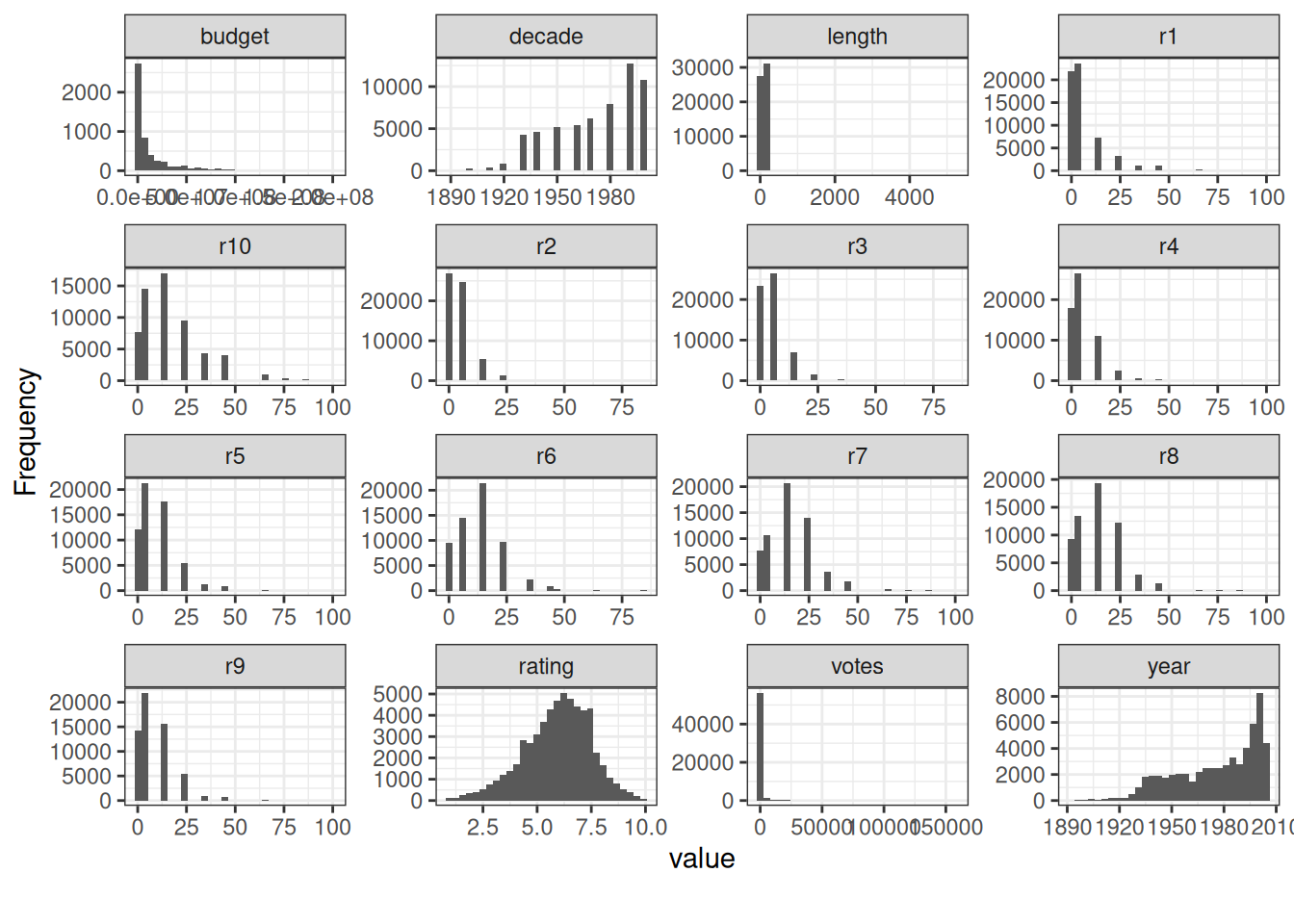
That’s a lot of information to take in all at once. For the next visualizations, we’ll reduce the number of columns to look at.
r1 to r10 gives the percentile of users who rated the movie that number. Interesting information in its own right. But we’ll concentrate on budget, length, rating, votes, and year. At least for the rest of this chapter.
There is one more thing we notice when looking at the histogram for length. Most of the values seem to be close to zero. But there are some extreme values around even 5000 that are skewing the view. Let’s see what the cause is by looking at the title and length of the ten longest movies in the data set.
So, a couple of cult classics. The Cure for Insomnia (5220 minutes) and The Longest Most Meaningless Movie in the World (2880 minutes) are in a category of their own. They are legit long films and not a mistake. Let’s still create a new tibble that includes only those movies that have a length of under 500 minutes.
Also, we’ll select the columns mentioned earlier. Budget, length, rating, votes, and year.
Let’s see how the four columns, length, rating, votes, and year look like as a boxplot when grouped by budget. Budget is a continuous variable. That’s why plot_boxplot() groups the values to 5 equal ranges.
movies_na_length_under_500 %>%
  plot_boxplot(
    by      = "budget",
    ggtheme = theme_bw(),
    ncol    = 4
  )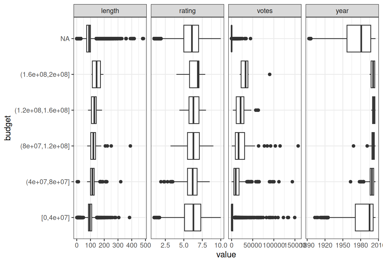
Based on the boxplot, the movies with a bigger budget tend to:
- have ratings inside a narrower range
- have better ratings
- have more votes
- be more recent
- be longer
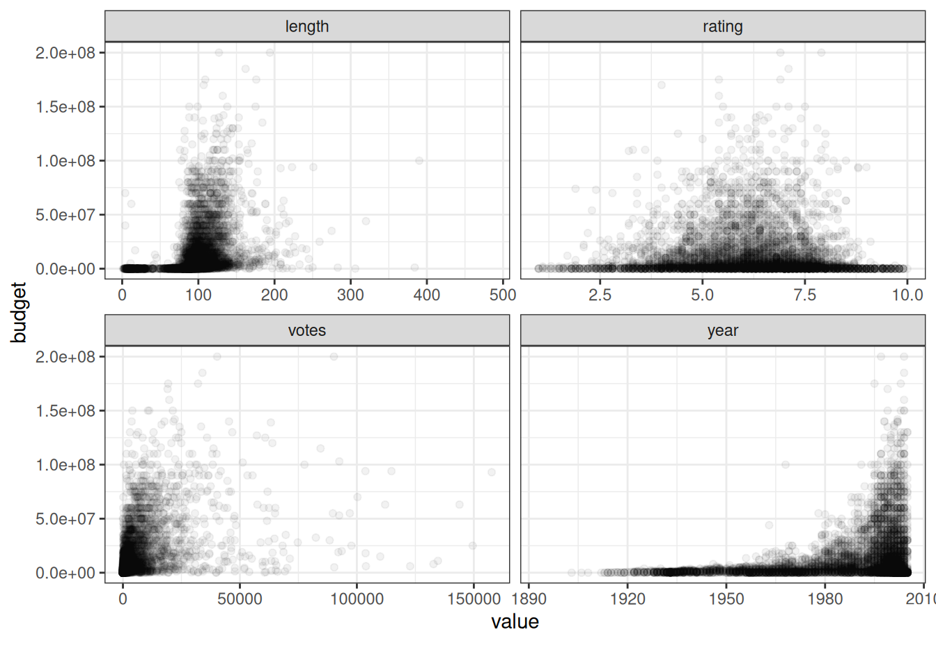
Let’s then take a look at what this all looks like as a scatter chart. We’ll use all the same columns. It’s important to use an alpha value that is low enough to reveal a more nuanced picture than we would see if it was 1.
movies_na_length_under_500 %>%
  plot_scatterplot(
    by              = "budget",
    geom_point_args = list(alpha = 0.05),
    ggtheme         = theme_bw(),
    ncol            = 2
  )
These are some of the ways to use DataExplorer to create a visual summary of a data set. I encourage you to dig into the documentation and see what else there is.
To conclude, DataExplorer has a function, create_report(). It creates a full EDA report from scratch. We won’t use that now, because the report would take too much space. But if you’re using DataExplorer, you should try it!
2.2.2.4 gt & gtExtras
DataExplorer is a good package, but it’s not the only game in town for EDA. gt (Iannone et al. 2026) is a package to create tables (Chapter 14) with.
Often, when you think about tables, you think about numeric and text values. But that doesn’t have to be the case. With gtExtras (Mock 2026) you can create a fast and easy visual summary of your data. The gt_plt_summary() function is all you need.
The function does have some limitations. It has had some issues with certain data sets. The movies data set didn’t work, for instance. That’s why we’ll take a look at the WorldPhones data set instead.
| . | ||||||
| 49 rows x 3 cols | ||||||
| Column | Plot Overview | Missing | Mean | Median | SD | |
|---|---|---|---|---|---|---|
Year1951, 1956, 1957, 1958, 1959, 1960 and 1961 |
0.0% | — | — | — | ||
ContinentAfrica, Asia, Europe, Mid.Amer, N.Amer, Oceania and S.Amer |
0.0% | — | — | — | ||
| Phones | 0.0% | 16,434.8 | 3,000.0 | 24,026.3 | ||
What we get is a table that combines a plot overview with basic summary elements: missing, mean, median, and standard deviation (sd)). You can also see from the icon on the left, whether the column is categorical or continuous. With the categorical columns, you can see a list of the categorical values by clicking the arrow.
2.2.3 Visualizing relationships
Most of the summarization techniques we’ve used so far have dealt with the distribution of values within one variable. But it’s also important to understand the possible relationships between different variables.
Understanding those relationships can provide insights into patterns, trends, and dependencies.
Two tools are available for this. A correlation matrix quantifies the relationships numerically. But since this book is about visualizing data, we’ll also visualize those numbers.
A pairwise plot matrix is a complementary visual tool to explore those relationships more deeply.
2.2.3.1 Correlation matrix
First, let’s tweak the data set to better fit our demo purposes. We’ll select the columns we wish to use. In this case, it’s all the columns with numeric values. Except for the ones about the ratings percentiles (r1-r10). And we’ll use drop_na() from tidyr to drop rows where any column has missing values.
library(dplyr)
library(tidyr)

movies_without_na_numeric <- movies_na %>%
  select(where(is.numeric) & !num_range("r", 1:10)) %>%
  # The second select() is to order the columns alphabetically.
  # Except for the names of genres that follow everything else.
  select(budget, length, rating, votes, year, everything()) %>%
  drop_na()
movies_without_na_numeric %>%
paged_table()We’re left with 5215 rows (observations) and 13 columns (variables). Still plenty enough to perceive exciting correlations between the columns.
Let’s first create a correlation matrix using the cor() function. It’s from base R and computes the correlation between the different columns. We’re using the Pearson correlation coefficient as the method (default). Remember it can’t determine a potential non-linear association between variables.
Due to the lack of space on the page, we’ll only look at these columns: budget, length, rating, votes, and year. If there was more room, we’d include the genre columns. But we’ll see them again soon enough!
corr %>%
  as.data.frame() %>%
  select(budget, length, rating, votes, year) %>%
  # We're using slice_head to filter only the first n rows. 5 in this case.
  # Without it, we would also have rows with the genres, ruining our matrix.
  slice_head(n = 5) %>%
  paged_table()
Of course, we can see the differences by looking at the values in the matrix. But it might be easier to get the bigger picture by looking at them graphically. For that, we’ll use ggcorrplot (Kassambara 2023).
This time, we’ll also include the genre columns. We’re interested in how they correlate with each other and the original five.
In its basic form ggcorrplot() only needs the data argument. So let’s first look at it without any modifications.
library(ggcorrplot)

corr %>%
  ggcorrplot()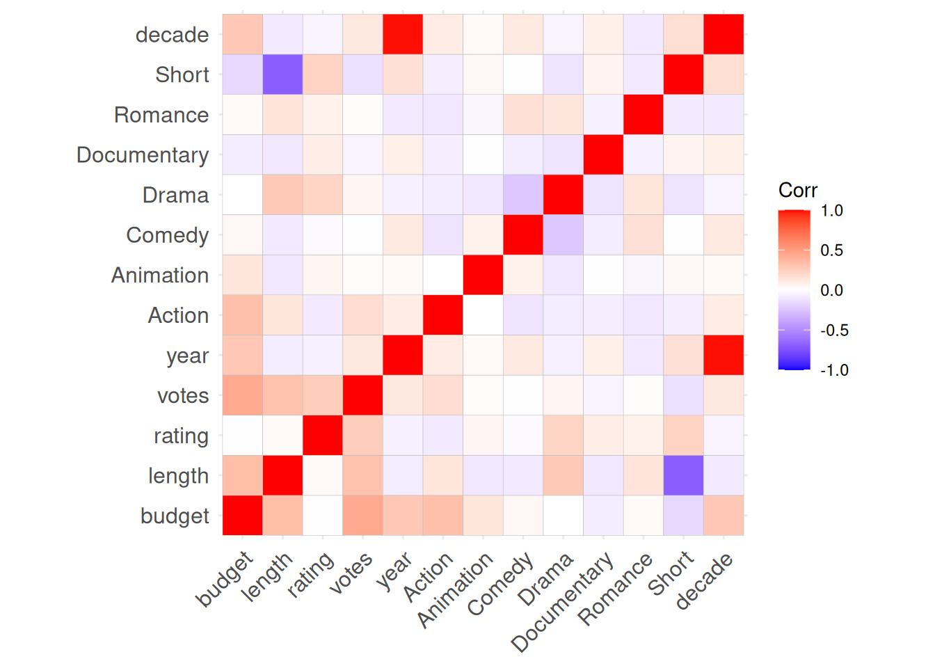
So, the way to interpret this is simple. The redder the square, the stronger the positive correlation between the two variables. Votes and budget, for instance. Which makes intuitive sense. The bigger the movie (budget), the more likely it is to garner attention from IMDb users. If we look at budget and rating, there is no discernible correlation between the two. This is an intriguing initial finding and we could investigate it further.
But, the bluer the square, the stronger negative correlation there seems to be between the two. The most obvious example here is the negative correlation between length and Short. Who would have guessed that the films in the Short genre would also be short in length? We can also see a negative correlation between the Short genre and budget. Which again makes perfect sense. You can also see the reverse effect when looking at budget and length. It strengthens the case further.
We’re still in the territory where most visualizations are for your eyes only. But there are some modifications we could make to the plot. Here are the parameters for ggcorrplot() we’re using (and why):
- Circle is the other method available. The bigger the shape, the bigger the correlation (negative or positive). Double encoding (also known as redundant encoding) is a two-edged sword. We should use it with caution. But here it can help distinguish the most noteworthy cases
- We can use one of the ggplot2 themes by using ggtheme. Using a clean theme like theme_bw makes the plot a bit easier to read
- All variables are perfectly correlated with themselves. It doesn’t make sense to show the diagonal. If anything, it makes reading the plot a bit harder. We can get rid of the diagonal by setting show.diag as FALSE
- Blue, white, and red are all fine colors. For a little more flavor, we can choose something else. Like dark turquoise, grey, and dark orange
corr %>%
  ggcorrplot(
    method    = "circle",
    ggtheme   = theme_bw,
    show.diag = FALSE,
    colors    = c("darkturquoise", "grey95", "darkorange3")
  )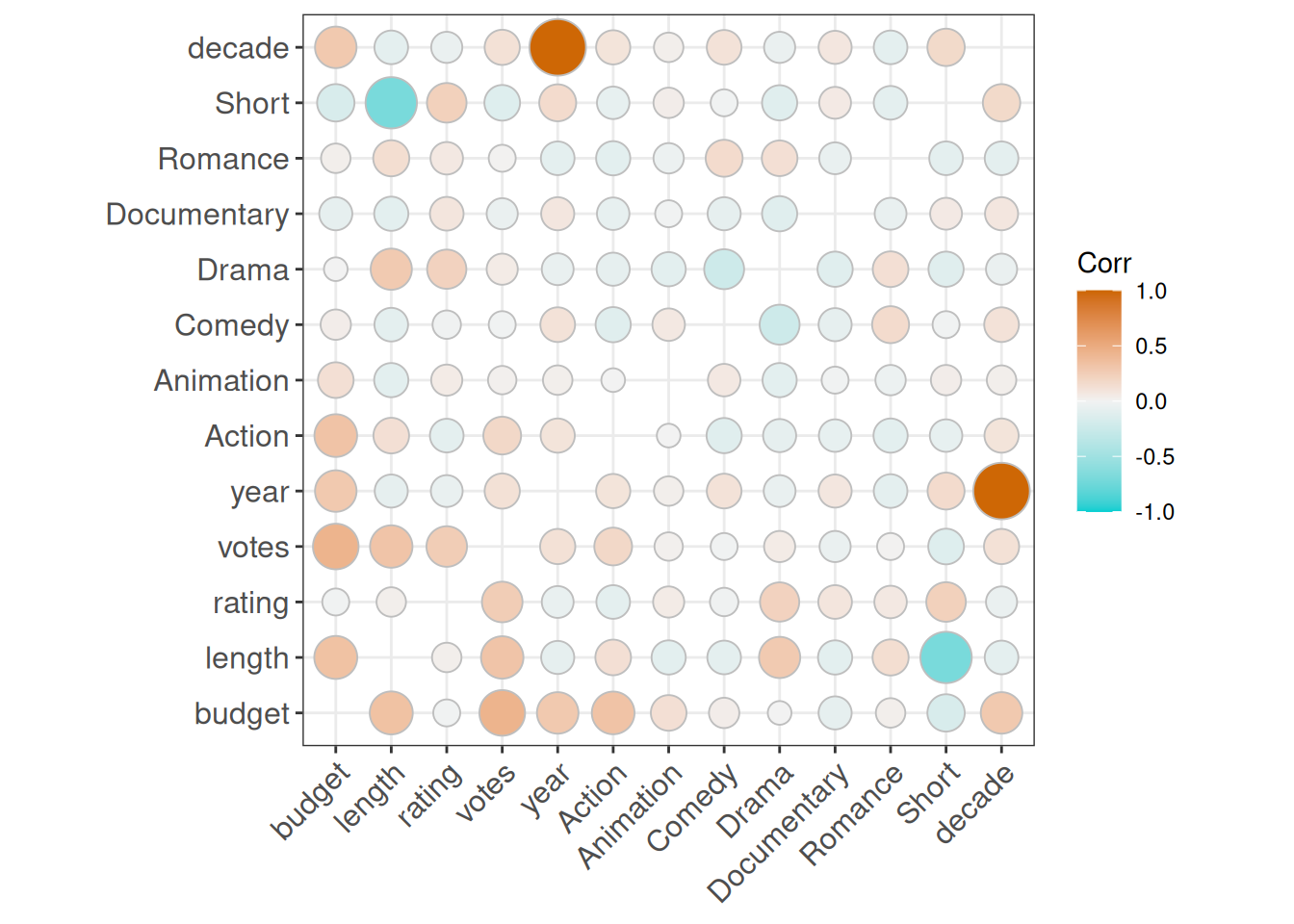
Much better! And here are some more genre-related insights based on the matrix:
- Drama has a fairly strong positive correlation with both length and rating
- Action films have the strongest positive correlation with budget
- Comedy and Romance have a positive correlation
- But so does Romance and Drama
2.2.3.2 Pairwise plot matrix
We already got a lot of information out of the correlation matrix. But as mentioned earlier, a pairwise plot matrix is a tool to explore the relationships within and between variables more deeply.
Again, we begin by fine tuning the data set. In this case we’re only interested in the Drama genre and how those films compare to the rest of the films.
movies_without_na_drama %>%
  paged_table()
To use a pairwise plot matrix we turn to GGally (Schloerke et al. 2025).
Let’s start with the basic ggpairs() function. We only need to tell it which columns we want to use. We’ll start by looking at the data set without the Drama column.
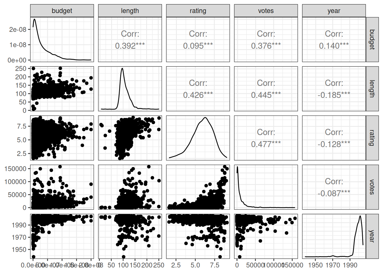
The matrix consists of three areas: upper, lower, and diagonal (or diag when it comes to function parameters). They can contain different types of plots and are customizable. But let’s first look at the defaults:
- Upper contains the correlation coefficient between the two variables
- Lower contains a scatter chart of the two variables
- Diagonal contains a density chart of the variable in question
It’s time to add Drama as color for the matrix. And also do some customizations:
- We know Drama is either “No” or “Yes”, so let’s pick two colors that go well together, dark orange and dark turquoise
- We can use functions to customize any part of the matrix
-
lower_function()creates a scatter chart where the points are somewhat transparent (alpha = 0.5). There is also a red linear trend line -
diag_function()creates a density chart. But why do we need to do that when the default already does the same? For some reason, default uses default colors, even if we map the colors as we have. But our function here does the trick
-
- Then we simply create the matrix
library(ggplot2)

# 1) Choose your colors
manual_colors <- c("darkorange3","darkturquoise")

# 2) Create functions for the lower half and the diagonal of the matrix
lower_function <- function(data, mapping) {
  ggplot(data = data, mapping = mapping) +
    geom_point(alpha = 0.5) +
    geom_smooth(method = "lm", color = "red")
}

diag_function <- function(data, mapping) {
  ggplot(data = data, mapping = mapping) +
    geom_density()
}

# 3) Add colors. Then customize upper and lower half, and the diagonal
# of the matrix. Lower and diagonal use the functions we created in step 2
movies_without_na_drama %>%
  ggpairs(
    mapping = aes(color = Drama),
    columns = c("budget", "length", "rating", "votes", "year"),
    upper   = list(continuous = wrap("cor", size = 3.5)),
    lower   = list(continuous = lower_function),
    diag    = list(continuous = diag_function)
  ) +
  scale_color_manual(values = manual_colors) +
  theme_bw()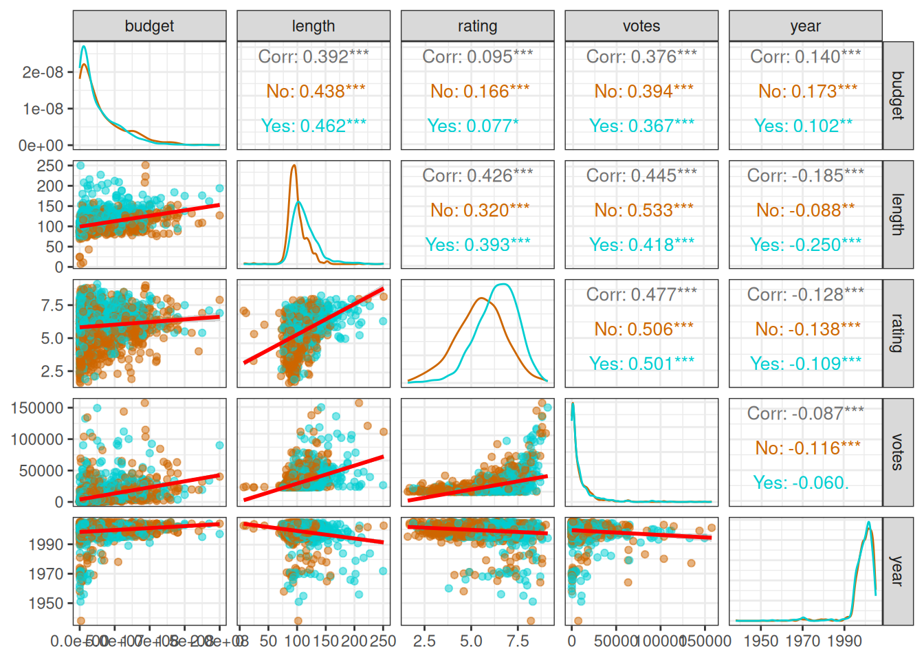
There are many differences throughout the data depending on whether the movie belongs to the Drama genre.
If you want to, you can do the same with other genres!
There are many other ways to customize a pairwise plot matrix. For the rest, see ggpairs() documentation.
2.2.4 Automated EDA app
Remember how I warned you about automating the EDA process using an app? We’ve spent some time learning how to perform EDA manually. Now is the time to explore some of the available automation tools: ExPanDaR (Gassen 2020), ggquickeda (Mouksassi et al. 2026), and radiant (Nijs 2026).
Let’s start with the similarities:
- Use shiny (Chang et al. 2026) to provide interactive web-based interfaces.
- Cut the coding required. In most cases, you load your data and call a single function to start the app.
- Enable interactive exploration. As you adjust inputs in the UI (select variables, filters, chart types, etc.), the output updates immediately in your browser.
- Support exporting your results in some form.
They differ in the scope of analysis and the amount of available features. This also affects the composition of their respective target audiences. Let’s take a closer look at each of them.
We’ll once again use movies_na_length_under_500 as the data set.
2.2.4.1 ExPanDaR
ExPanDaR is especially good for panel data (with both cross-sectional and time-series dimensions). You can examine summary statistics, visualize distributions, and relationships. You can also perform linear regression analysis. ExPanDaR even allows for simple experimental tests to verify robustness. Splitting data into training and test samples, for example.
A key feature is the ability to share analyses without revealing the raw data. This enables researchers to assess the robustness of empirical results within the app. Or to export an R Notebook of the analysis for reproducibility.
For these reasons, ExPanDaR’s target users are academic researchers.
To start the ExPanD Shiny app:
Here’s an example screenshot of the Scatter Plot section of the app. You choose the variables with the dropdown menus. There can be extra choices to make. In this case, whether to use a smaller sample and display a smoother as seen in Section 2.2.3.2.
For a full working example of the app in action, visit Exploring the Accrual Landscape by Open Science.
2.2.4.2 ggquickeda
ggquickeda enables a rapid exploration of your dataset by generating a range of plots (e.g., scatter plots, box plots, bar charts, histograms, and density plots) and summary tables.
The app also generates descriptive statistics tables for one or many variables. A notable feature is support for visualizing survival analysis. ggquickeda includes custom geoms and stats (e.g., geom_km) to plot Kaplan-Meier survival curves and confidence bands. This makes it especially handy for clinical or time-to-event data.
The target audience for ggquickeda is analysts and R users who want rapid insight into their data through visualization, but prefer a graphical user interface (GUI) approach. ggquickeda includes an Export Plot Code feature that reveals the underlying ggplot2 code for any graph you create. This makes it easy to customize the plots further outside the app.
library(ggquickeda)

movies_na_length_under_500 %>%
  run_ggquickeda()
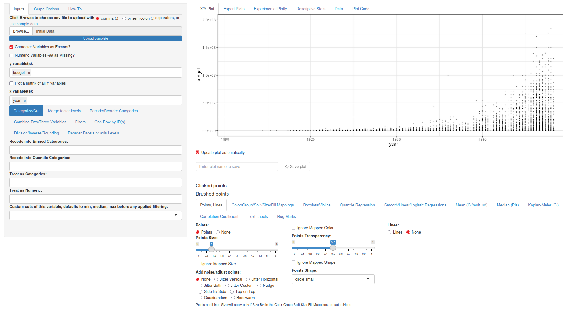
Here’s an example screenshot of the X/Y Plot section of the app. There are more choices to make compared to ExPanDaR.
For a more comprehensive introduction to the features, there’s an hour-long webinar from Certara R School.
2.2.4.3 radiant
Radiant isn’t only an EDA tool but a comprehensive Shiny application that covers the entire analytics workflow. From data import and cleaning to exploration, modeling, and even decision-making. For the scope of this book, we’ll concentrate on the EDA part.
Radiant combines several modular packages (radiant.data, radiant.design, radiant.basics, radiant.model, radiant.multivariate) into one unified app.
Radiant is for business analysts, students, and instructors in business and statistics. It’s used in classrooms, allowing learners to focus on concepts rather than syntax.
Radiant can generate an R Markdown report of all your analysis steps or let you save the state of the app. The state file is a snapshot of all inputs and selections, which you or others can reload later to reproduce the exact results.
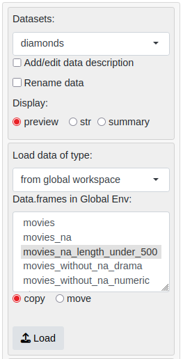
Since we can’t provide radiant with the data set in the code, we’ll do it inside the GUI:
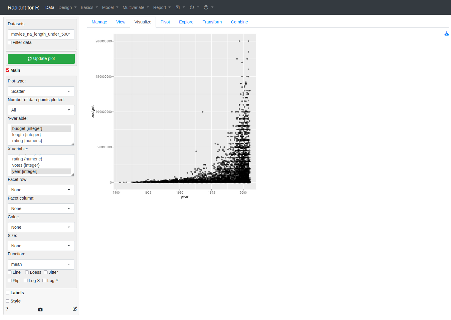
Here’s an example screenshot of the Visualize section of the app. The app design is closer to ggquickeda than ExPanDaR.
For a more comprehensive introduction to the features, check the Radiant Tutorial Video Series.
2.2.4.4 Comparative summary
In conclusion, each package excels in a different niche. They all leverage the power of R through an interactive interface, so the best choice depends on the use case. Choose the one whose design philosophy matches your analysis needs.
| Package | Focus & Scope | Unique Strengths | Ideal Use Cases |
|---|---|---|---|
| ExPanDaR | Particularly for panel data (longitudinal data sets) | Robust modeling features, reproducible reports | Academic research, teaching, panel data analysis |
| ggquickeda | Quick visualization and summary statistics | Quick plots, Kaplan-Meier survival curves | Quick EDA, initial data inspections, simple visualization |
| radiant | Comprehensive business analytics platform | Broad analytics toolkit, decision analysis | Business analytics, education, end-to-end analysis workflow |

